Copyright: Modern Artists: Artvee
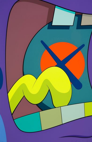
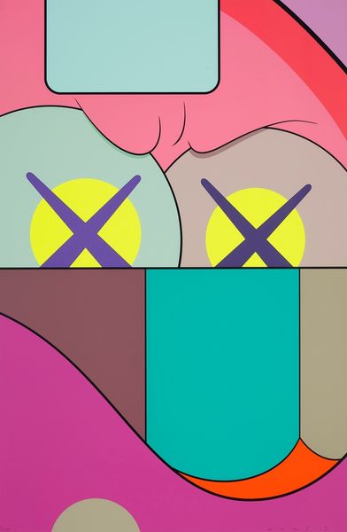
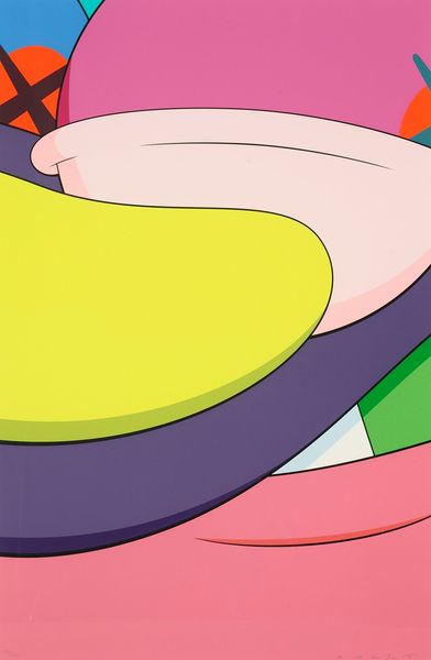
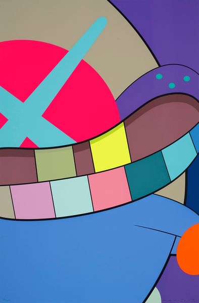
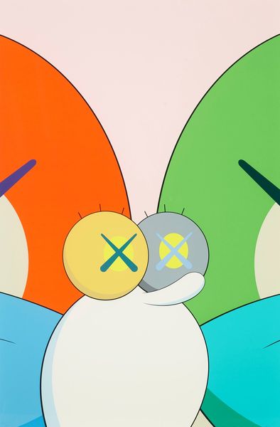
Kaws made this piece, No Reply #6, without indication of process, a celebration of flatness in a world of depth. I love the colour choices in this piece. The palette is cool yet vibrant, like an 80s beach ad, which, combined with the simplified forms, gives a real graphic feel. You can't tell what kind of tools were used here, or how the colours were applied, but you do get the feeling of something smoothly and carefully done. The surface seems so uniform it could be a print, but I suspect its paint. Look at how the lines of the shapes interact, particularly where the blue crosses intersect on the pink disc. The artist embraces flatness as a concept here, denying any possibility of perspective in its arrangement of solid colors. It’s a real exercise in colour and shape. For me, this piece chimes with the work of someone like Ellsworth Kelly. There's a similar sense of bold simplicity, a confidence in the power of abstraction. The title hints at themes of communication in the modern age, something Kelly was less interested in, but both artists show us how much can be achieved when we embrace ambiguity, and allow the artwork to do the talking.
Comments
No comments
Be the first to comment and join the conversation on the ultimate creative platform.
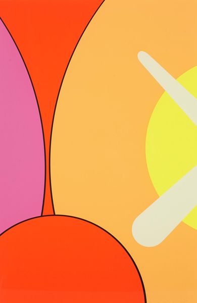
More like this