Copyright: Modern Artists: Artvee
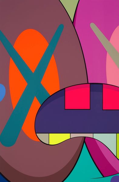
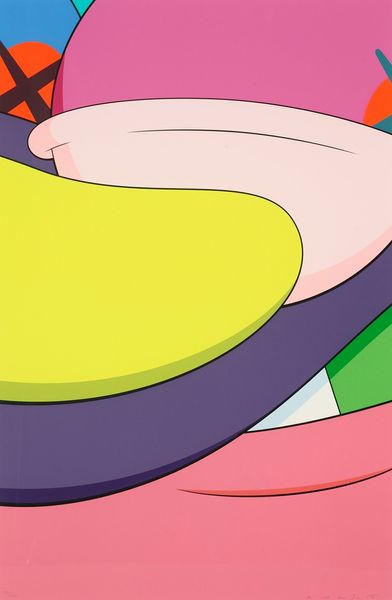
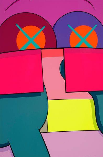
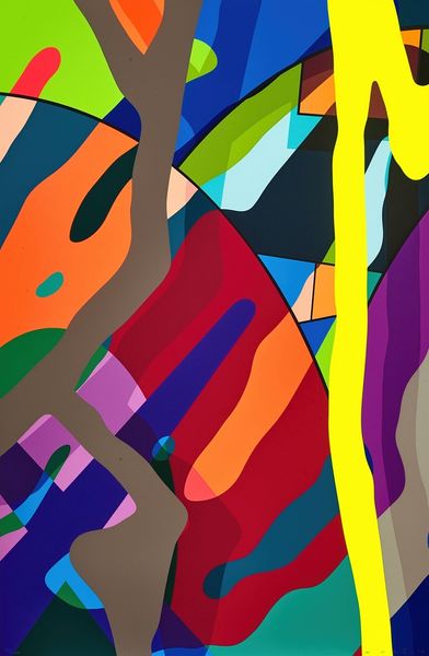
Curator: This is KAWS’s “No Reply #4,” from 2015, a striking piece with bold color fields. What strikes you about it first? Editor: Immediately, it’s the clean division of space and the use of very artificial colours. The finish is flawless. I’d wager it’s an acrylic silkscreen print? Very commercial, which isn't inherently negative, of course. It's so manufactured looking, though. Curator: Precisely! These smooth, almost unreal tones against these clean lines create a really unsettling feeling. Think about how the graphic language of comics and cartoons often conveys complex emotions. The "X-ed" out eyes, the abstraction... they are laden with associations and meaning. It reminds us about this constant cycle between cultural images and feelings. Editor: Absolutely. There’s a tension between that immediate accessibility you mentioned – the language of mass production – and then, like you point out, that more nuanced exploration. What about the choice of material here? The silkscreen allows for perfect reproduction and control over the pigment and surface. Curator: This work to me operates on a cultural level by leveraging a very flat vocabulary of cartoon imagery and abstraction. The composition echoes classic op art motifs, the flat colour palette makes it visually immediate while retaining cultural weight. Editor: I agree, I'm also drawn to this flattening out. How are those references functioning here and shaping how an audience would be likely consuming this imagery and work overall? Curator: In that light, it feels very ambivalent about consumer culture itself. We consume art. Editor: Food for thought... KAWS is certainly a phenomenon, and thinking about the choices involved in the process of production allows us to understand it better, rather than taking it at face value. Curator: Agreed! Considering what the symbols of commercialism and art really signal, or hide.
Comments
No comments
Be the first to comment and join the conversation on the ultimate creative platform.
More like this