graphic-art, print, engraving
#
graphic-art
#
baroque
# print
#
engraving
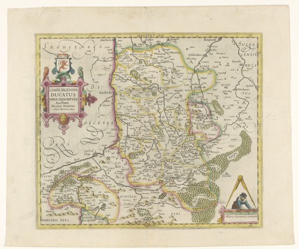
Dimensions: height 404 mm, width 516 mm
Copyright: Rijks Museum: Open Domain
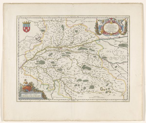
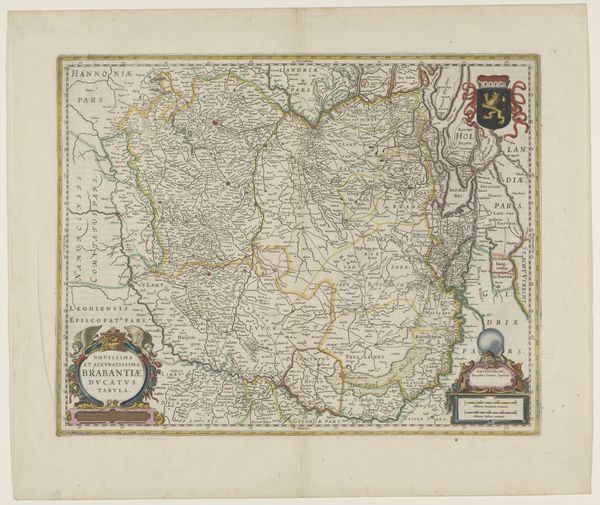
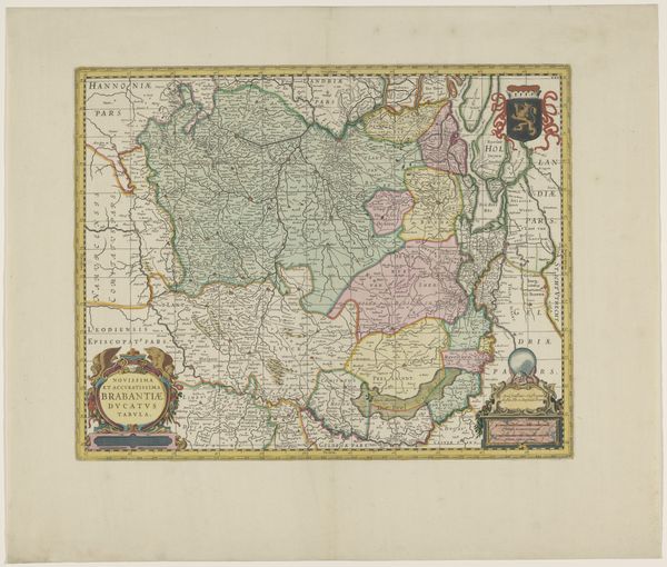
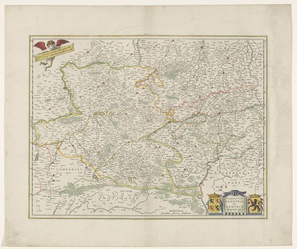
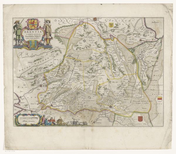
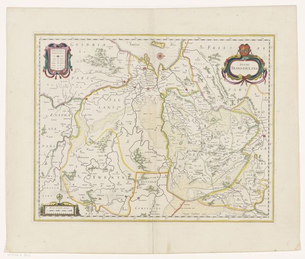
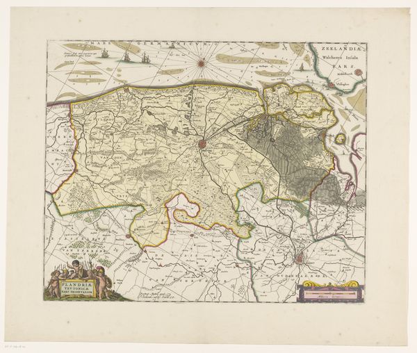
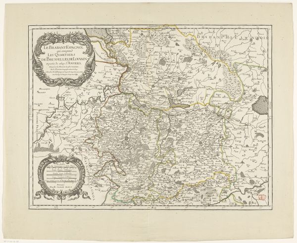
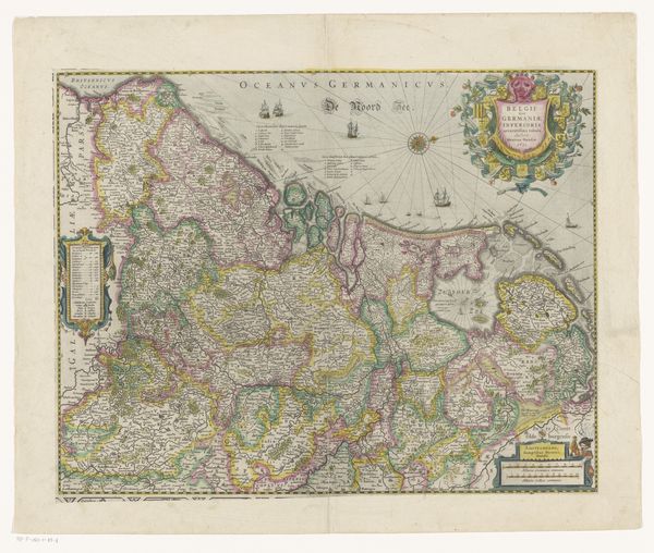
Editor: This is a print from around 1666-1680, titled "Kaart van het hertogdom Luxemburg," which translates to "Map of the Duchy of Luxembourg". It's an anonymous engraving that gives such a detailed view of the region. I find it amazing that cartographers of the time were able to record so much detail without modern technologies. As you look at this map, you might find that, beyond a historical record, there’s an artistry to the arrangement and composition, but I’m curious to hear your thoughts about how the art style communicates information. What strikes you most when considering it? Curator: Considering the intrinsic qualities of the map, one cannot help but note how graphic organisation, while intending to illustrate spatial relationships, achieves a delicate balance of representation and ornament, that, perhaps unexpectedly, yields beauty. I wonder whether you see how the use of hatching and stippling to delineate geographical features such as hills or forests transcends the function of pure representation and achieves some status as artistic gesture? Editor: I see what you mean. The density of lines in the forests definitely adds a texture that's almost tactile. And the varying line weights create a sort of hierarchy among the elements on the page. Curator: Precisely. Now consider how colouration is judiciously applied to emphasise key political and geographical boundaries. It’s subtle, isn’t it? How different parts of the duchy gain prominence not just by geographical space but colour! And the embellishments, those cartouches and compass roses. Do they merely serve as decorative flourish, or can they be seen as semiotic devices reinforcing ideas of order and the domain’s power? Editor: That's insightful. It never occurred to me that they could be tools of empowerment too. It really elevates the reading of the work. Curator: Indeed, so you see that the graphic qualities are always ideologically charged; visual languages have consequence. Editor: I learned how focusing on these structural elements within the work gives us more to understand about its purpose. Curator: It seems even something as seemingly functional as a map carries many layers of meaning embedded in its visual fabric.
Comments
No comments
Be the first to comment and join the conversation on the ultimate creative platform.
More like this