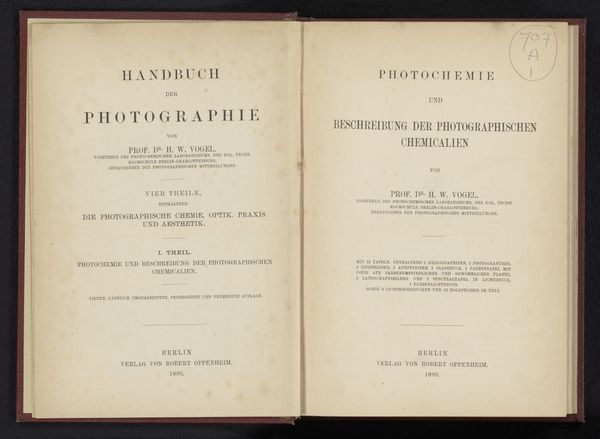
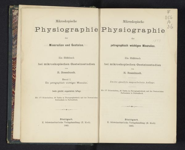
La typographie à Bruxelles au début du XXe siècle / par J.-Laurent-M. Perquy 1904
0:00
0:00
graphic-art, print, typography
#
graphic-art
#
aged paper
#
art-nouveau
#
paperlike
# print
#
sketch book
#
personal journal design
#
typography
#
journal
#
thick font
#
handwritten font
#
letter paper
#
thin font
#
publication design
Dimensions: height 247 mm, width 170 mm, thickness 41 mm
Copyright: Rijks Museum: Open Domain
Curator: The book "La typographie à Bruxelles au début du XXe siècle" by J.-Laurent-M. Perquy, published in 1904, is primarily a work in typography. It is an illustration of early 20th-century graphic design. Editor: Yes, I see the details in typography used here! I notice the book has an elegant, aged quality to it. What can you tell me about its stylistic construction and materiality? Curator: Observe how the layout achieves balance through asymmetrical arrangement and contrast. Note the interplay between varied font weights. Thin, delicate type contrasts with bold, block-like fonts to draw attention. The color palette, consisting mainly of creamy, warm tones, is very soft. The visible paper texture enriches the vintage impression of age. Consider what semiotic function the typography serves here. How do you read it? Editor: The visual hierarchy guides the eye. The title leaps out, immediately announcing the book’s theme, and there seems to be an intricate relationship between text and image. Are you saying the book uses a limited range of visual elements to reinforce a simple message about modern art, or perhaps reflect modernity itself? Curator: Precisely. The composition reflects a conscious application of aesthetic principles of the era, carefully deploying each element. The printer has attended to formal properties rather than attempting photorealistic renderings. How do these forms operate together? Editor: This book seems to capture a particular moment in the history of typography in Brussels, focusing attention on text itself, on printed text as an artistic image. Thanks for pointing out its graphic qualities. I see that now. Curator: Yes, by emphasizing the intrinsic qualities of form, texture, and line, the printer transforms typography into art. An interesting approach indeed.
Comments
No comments
Be the first to comment and join the conversation on the ultimate creative platform.
More like this