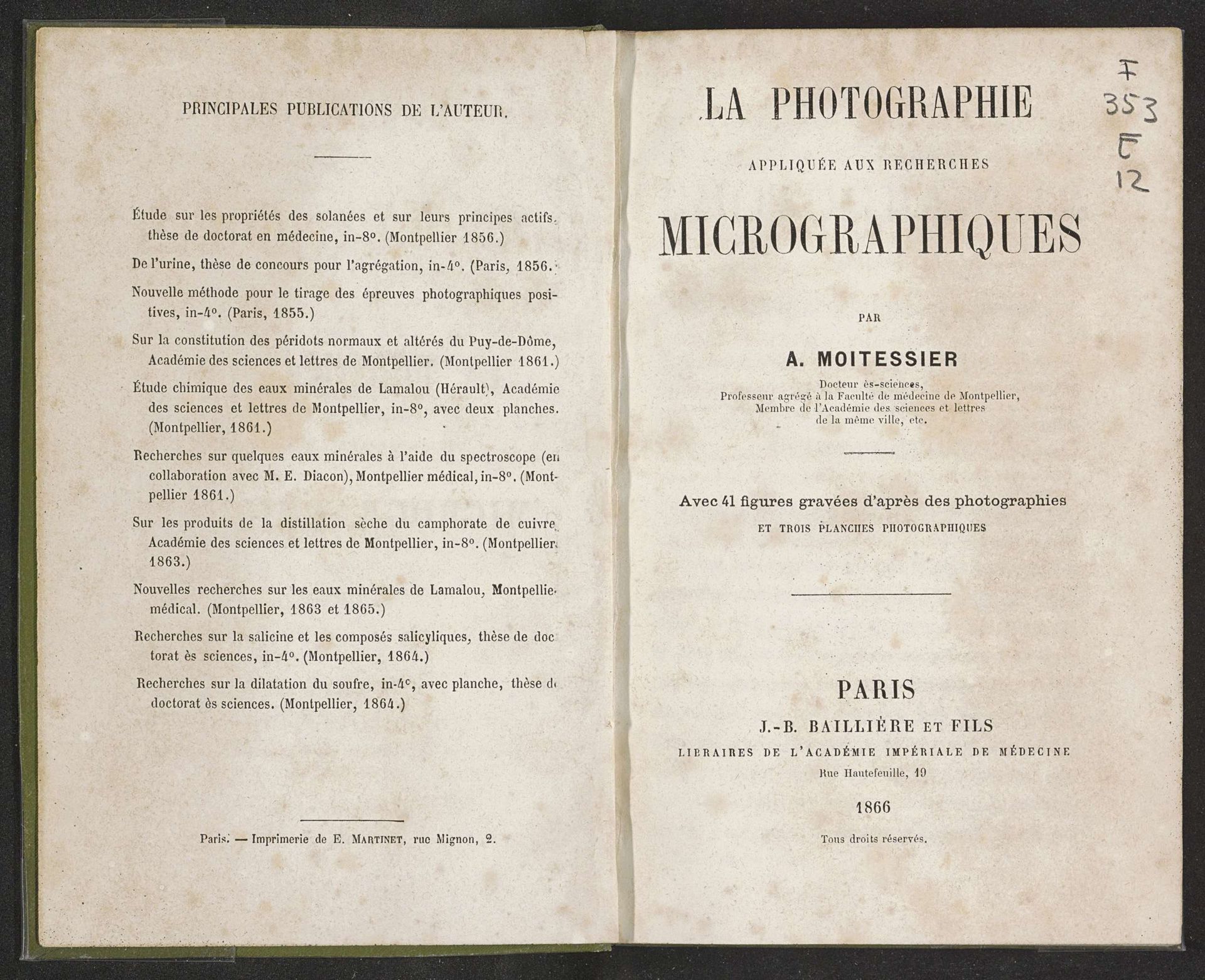
1866
La photographie appliquée aux recherches micrographiques
Listen to curator's interpretation
Curatorial notes
Curator: Let’s examine "La Photographie Appliquée aux Recherches Micrographiques," a title page dating back to 1866 by A. Moitessier. It promises an exploration into micrography aided by photography, quite the combination of emerging technologies for the time. Editor: It’s striking how the typeface conveys such authority, the use of varying font sizes seems purposeful, creating a hierarchy that really draws the eye. There is something about the cream color paper and the way the ink is bleeding out that just lends an overall tone of academia. Curator: Precisely, the typography isn't merely decorative, but rather is functional; its purpose is clearly to establish both academic and technological credibility in the book as an object and in the research documented in its pages. Consider the context: Photography was still relatively novel, its integration with microscopic study suggesting innovative and important research. Editor: And those lines detailing “41 figures gravées d'après des photographies” are very intriguing; I am wondering how photography informs the engravings and how the materiality of paper helps transmit scientific objectivity in that time. The detailed text, reminiscent of copperplate script, lends it a distinguished yet somehow aged feel. It invites the viewer closer to examine these words from another era. Curator: The list on the opposing page highlights earlier publications of the author, hinting at Moitessier's established academic standing in the community of his time. Each listed title emphasizes his focus on scientific inquiry, specifically in medical applications; he definitely establishes credibility. It also indicates that the pursuit of scientific authority was happening on many stages. Editor: Yes, and just look at the careful spacing, it balances the composition wonderfully and directs us to the book title and authorial names that appear to us here and now with clarity. Curator: I would argue the choice of paper and the style of printing serve more than just an aesthetic purpose, it's a declaration of seriousness. Publishing through J-B Bailliere et Fils, "Libraires de l’Académie Impériale de Médecine" adds more prestige, linking this work to an esteemed medical establishment. Editor: Considering how printing qualities affect our reading experience reminds me that form and content truly cannot be separated; typography and image, I find, were intended to create a unified object—a vehicle for the knowledge, yet already bearing the mark of passing time. Curator: So we see that, at its essence, this title page embodies the scientific ambition of the mid-19th century and it’s clear how institutions of science had to construct meaning with all aspects of their materials. Editor: The aged aesthetics remind me that scientific findings, much like the artworks of a specific time, often gain value through continuous revisiting, engaging in different methods of reading across eras, so it makes me more inclined to know about micrography and see where Moitessier's contributions ended up leading.