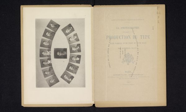
La photographie appliqué à la production du type d'une famille, d'une tribu ou d'une race 1887
0:00
0:00
print, photography
#
portrait
# print
#
book
#
photography
#
orientalism
Dimensions: height 210 mm, width 148 mm, thickness 3 mm
Copyright: Rijks Museum: Open Domain
Editor: Here we have Arthur Batut’s 1887 print, a page from his book "La photographie appliquée à la production du type d'une famille, d'une tribu ou d'une race." The layout strikes me immediately - it’s like a visual taxonomy, a way of categorizing people. What’s your take on how he presents his photographic work here? Curator: Indeed. We should analyze the composition of this spread in its structural elements, the semiotic signs involved in creating and shaping collective identity. The symmetry, first of all. A single plate with photographs contrasts with the title page featuring black typography against a subdued ivory field. Observe that circular arrangement. Editor: It feels a bit...clinical, doesn’t it? The circle of faces almost like specimens. Curator: Precisely. And where does the eye travel? Notice the typography and font style in French, what statements is the text trying to communicate? How does that font contrast or mirror the visual images on the opposing page? Editor: I see what you mean about the typography now! The text itself is also making a sort of visual statement in a very formal and austere kind of font. How fascinating. Curator: Correct. And we should also think about the overall shape, scale and textures. The two pages are in conversation about methods of classification. A system. Editor: So by analyzing Batut’s choices in typography and composition, we can see that he was trying to bring structure to how he documents his work? Curator: Yes, through structural semiotics and arrangement. The meaning comes together. Editor: I had never really thought about typography making such a deliberate visual point before. Thanks for pointing it out to me. Curator: It is there where additional elements of identity are communicated, indeed.
Comments
No comments
Be the first to comment and join the conversation on the ultimate creative platform.
More like this