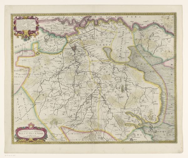
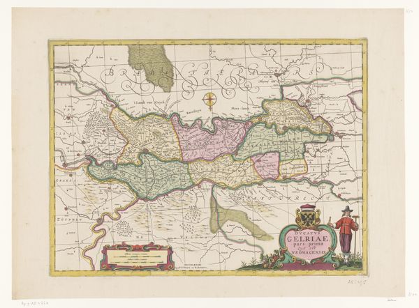
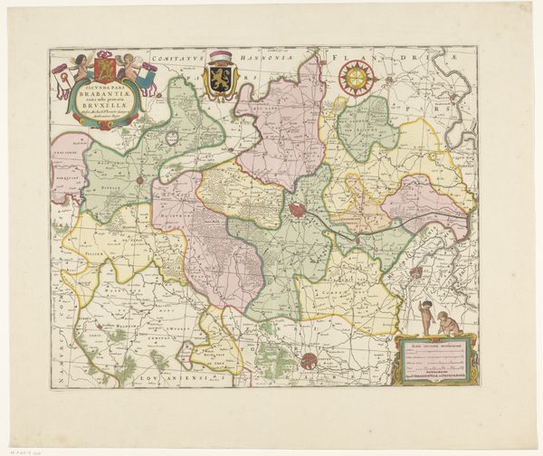
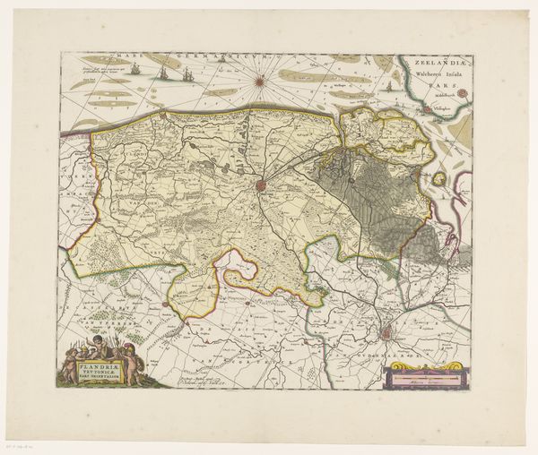
print, etching
dutch-golden-age
etching
landscape
geometric
watercolour illustration
Dimensions: height 385 mm, width 517 mm
Copyright: Rijks Museum: Open Domain
Curator: Here we have an exquisite map titled "Kaart van het graafschap Zutphen" or "Map of the County of Zutphen," dating roughly from 1644 to 1711. It’s a captivating example of Dutch Golden Age cartography, made with etching techniques. Editor: Immediately, what strikes me is how quaint it is! A watercolour illustration aesthetic but not a drop of watercolour has been involved. There’s an unexpected softness to this map; even though its intention must be very matter of fact, practical almost, the execution leans towards the fanciful, dreamlike. Curator: Absolutely. It’s so meticulously detailed, though, isn’t it? This wasn't just about documenting geographical boundaries, but really crafting a portrait of the land. It becomes more about the experience of a space, which is pretty neat. Editor: Agreed. You know, the borders feel particularly relevant now. They underscore how fluid concepts like nations or regions really are. They're a construct, changing and morphing with political winds or evolving identities. It is as relevant today as when the artist did it. It highlights, intentionally or unintentionally, the political motivations that underpin all representation, particularly cartography. Curator: Do you think so? For me, it reminds me of our place within something much larger, bigger. We’re always so caught up in what we can immediately grasp in front of us, and art pieces such as this one gently asks, why not consider looking further afield. Perhaps the work gently insists that this perspective helps better contextualise the everyday, helps to look at the world and consider things such as political constructs, as you suggested. It also hints that there are places that might exist, and stories being told. That you don't quite yet have access to. Editor: I like that notion of accessing other stories. But this idea of boundaries, literally lines drawn that then dictate destinies. They define who is 'in' and who is 'out,' impacting resources, identities, even self-perception. It really echoes contemporary anxieties about inclusion, belonging, borders... who gets to cross them and what does it mean? Curator: That’s something I had never previously considered when appreciating maps. I love learning, it is almost like opening my mind and pouring fresh coffee in there. Thinking about that context enhances the artwork exponentially for me now. I must say thank you. I think from my side I also see the piece in new light too. Now, thinking of it this way, what do you make of that crown detail that surrounds the lettering. Editor: Another mark of self-importance; almost an admittance from the cartographers or society to remind those viewing that the lands belonged to people. The crown feels more like a sign that screams THIS LAND WAS TAKEN from someone rather than this land has just been fairly discovered and mapped for accessibility purposes. Curator: This conversation shows how layered historical images can be, how the context breathes life into lines on a page. Editor: Absolutely, I find these things both scary but useful in understanding the wider picture. Maps have the intention of being accessible but if we were to dig beneath, who's vision are we using? And that for me is a brilliant opportunity to keep on looking and questioning.
Comments
No comments
Be the first to comment and join the conversation on the ultimate creative platform.