Curatorial notes
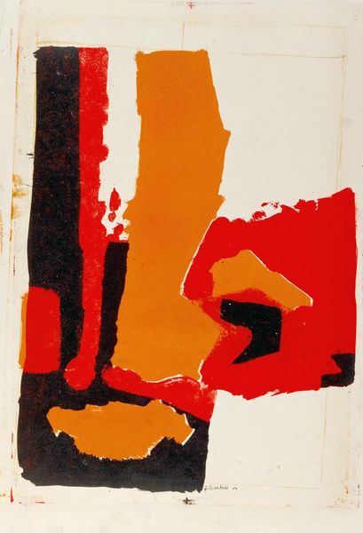
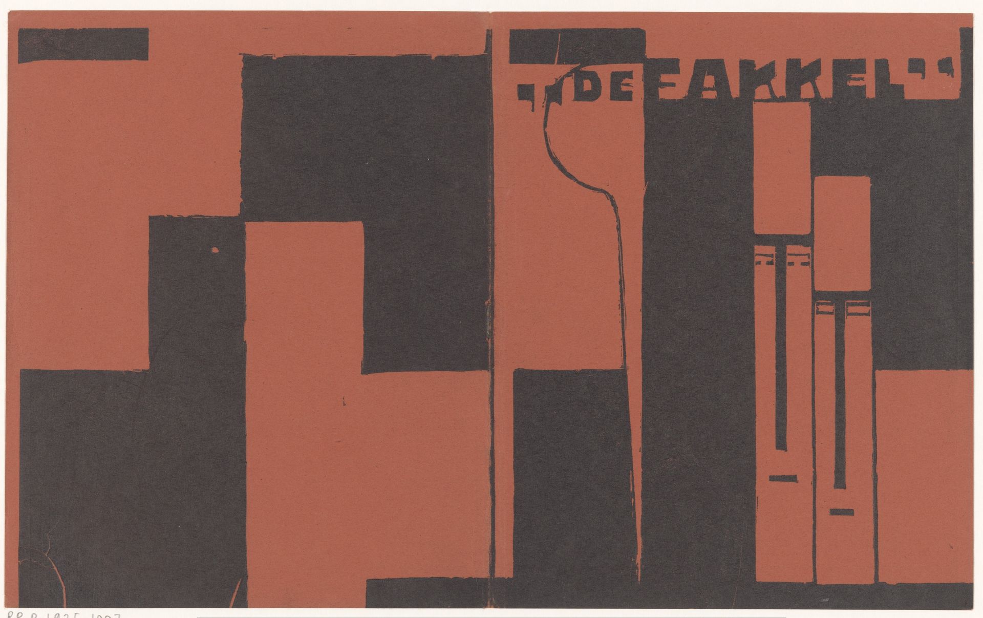
Hendrik Chabot made 'De Fakkel' with paint, but it's the bold, graphic approach to the mark making that really grabs you. He's not trying to be subtle here! The colours, brick red and black, are laid down in these very deliberate blocks. You can almost see Chabot wrestling with the composition, pushing these shapes around like pieces in a puzzle. There's a real physicality to the paint, it feels thick and kind of matte. The paint application gives the blocks a presence. Look closely at the thin red line suggesting a torch. It's so delicate compared to everything else, it’s almost a joke. It's like Chabot is saying, "Yeah, I know this is supposed to be a torch, but I'm more interested in the shapes it makes." It puts me in mind of the way Stuart Davis plays with the tension between representation and abstraction. It doesn't offer easy answers, and I like that.