Dimensions: 45.7 Ã 76.2 cm (18 Ã 30 in.)
Copyright: CC0 1.0
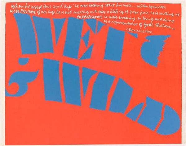
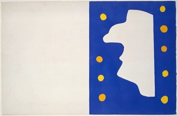
Curator: Looking at Corita Kent’s print titled "(tame) to leave to love," I'm struck by the bold colors and how the text seems both prominent and hidden. Editor: It feels like a visual koan, doesn't it? The blocky letters almost dare you to make sense of it while the handwritten script hints at a deeper, more personal meaning. Curator: Kent was fascinated by combining advertising slogans with spiritual messages, so I read this as a modern-day icon. The colors feel like a graphic punch, but the words speak to a longing and a need to let go. Editor: The blue circle, almost floating above the "TO," feels like a symbol of infinite possibility – an opening up. The red, of course, is passion, action. It's a powerful combination when set against the vulnerability within the handwritten script. Curator: Precisely. It's a reminder that within simplicity, there's depth and that even in the most basic design, there is always room to find meaning. Editor: Yes, I think I’m ready to leap into that simplicity.
Comments
No comments
Be the first to comment and join the conversation on the ultimate creative platform.
More like this