#
abstract expressionism
#
popart
#
op-art
#
op art
#
pop art
#
geometric
#
abstraction
#
hard-edge-painting
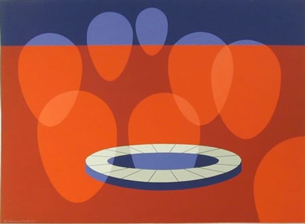
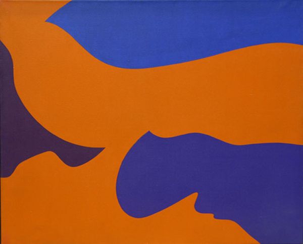
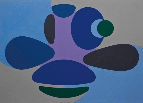
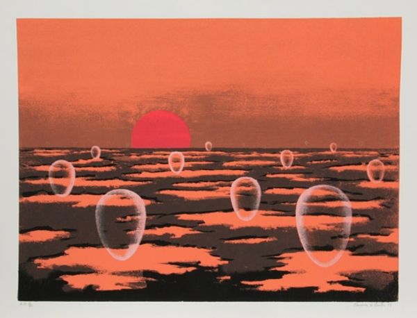
Copyright: Clarence Holbrook Carter,Fair Use
Clarence Holbrook Carter made "Transection I" with I'm guessing paint, maybe screen printing. It's such a calming piece, with these smooth flat planes of color, like someone took a deep breath and just laid it all down. I love the way the cool blues meet that warm orange, it feels like a sunset over a very still lake. The circles feel hypnotic, pulling you in. Look at how they ripple out from those shapes. Are they floating, or sinking? Are they solid, or just reflections? It's hard to tell, and I think that's the point. It reminds me a bit of some of Agnes Martin's more out-there pieces, but with this totally different vibe. There's something very zen about it, a quiet invitation to just be present and contemplate.
Comments
No comments
Be the first to comment and join the conversation on the ultimate creative platform.
More like this