Copyright: Modern Artists: Artvee
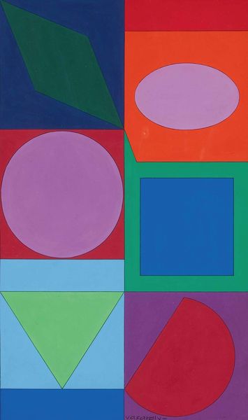
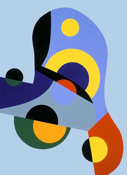
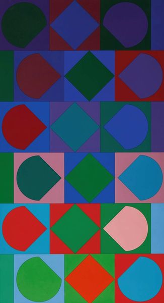
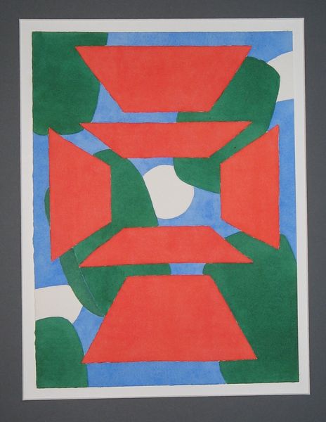
Editor: Here we have "Cornic," a 1981 acrylic on canvas piece by Victor Vasarely. I find it very calming, almost meditative, with the simple shapes and cool color palette. What compositional elements stand out to you? Curator: Note how Vasarely’s strategic placement of geometric shapes—primarily curvilinear forms—interlocks figure and ground, a key element of Op Art. The artist has not just represented shape, but also the perception of space through precise manipulation of chromatic relationships. Do you see how the colours are not simply decorative but active? Editor: Yes, the shades of blue create an interesting visual depth, like some shapes are receding and others are coming forward. How does that affect your reading of the work? Curator: Indeed. This dynamism engages the viewer’s visual cortex, prompting an oscillating sensation between stillness and movement. This effect underscores the intrinsic flatness of the canvas, even as the painting implies three-dimensionality. What of the texture of the brushwork within those shapes? Editor: It looks smooth. The subtle gradients and consistent application suggest an interest in surface uniformity. There is little trace of gesture. Curator: Precisely. This technical approach minimizes distraction and redirects our attention to the underlying formal structure. The composition thereby declares its artificiality. It’s constructed, planned, and meticulously executed, highlighting an investigation of optical phenomena. I also observe the interesting variation in rounded edges, and the occasional hard edge within the arrangement. What do you think about these variations? Editor: I suppose the curves do soften the stark geometry, adding an organic quality, though subtly, which counters the industrial feel I sometimes get with Op Art. This piece is gentler somehow, perhaps less confrontational? Curator: That is insightful. We might conclude then, that Vasarely achieved a delicate balance—oscillating between rigorous structure and perceptual ambiguity, hard edge and curvature, resulting in a visual experience which activates our perception. Editor: That has definitely reshaped my initial perspective. I see it now as a more sophisticated interplay of form and colour, far beyond just "calming." Thanks for sharing your insights!
Comments
No comments
Be the first to comment and join the conversation on the ultimate creative platform.
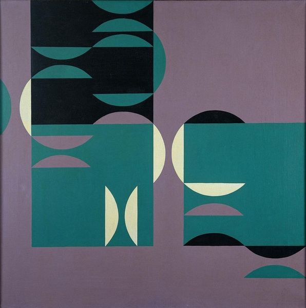
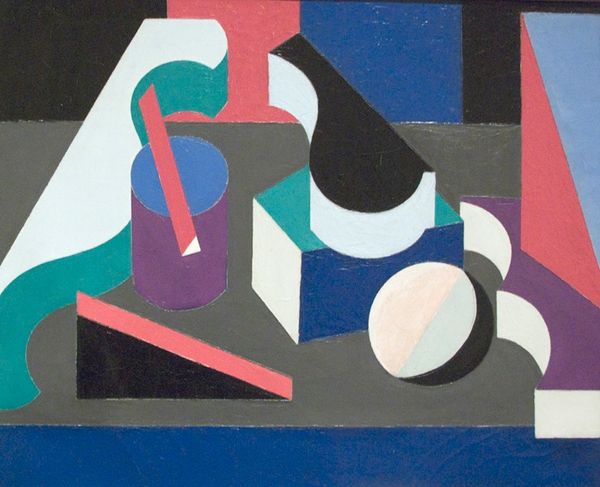
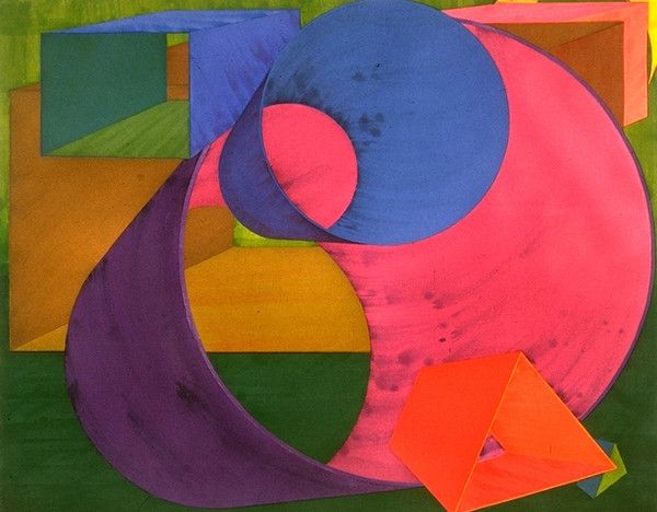
More like this