graphic-art, typography, poster
art-deco
graphic-art
typography
poster
Dimensions: height 412 mm, width 265 mm, height 122 mm, width 216 mm
Copyright: Rijks Museum: Open Domain
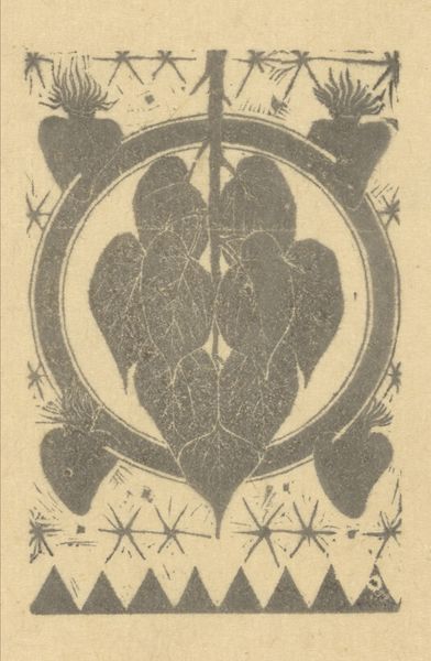
Non Grevers made this Calendar design for 1926 using a graphic, printmaking approach. The repeated motifs and stylized figures feel almost stenciled, like a process of layering and building up shapes. I think about how each mark is a decision, a commitment to a certain form. The flat purple ink on the light brown paper creates a striking contrast. There’s a real feeling of texture even though it's a print. Look at the way the repeating waves create a sense of movement. My eye's drawn to the central figure with what looks like two sticks. The figure is surrounded by flames which creates a symmetrical pattern. It reminds me a bit of Hilma af Klint's work in the way that it mixes symbolic imagery with geometric abstraction to produce a sense of otherworldly design. Art is always evolving.
Comments
No comments
Be the first to comment and join the conversation on the ultimate creative platform.