graphic-art, print, typography, poster
#
graphic-art
#
art-nouveau
# print
#
typography
#
poster
Dimensions: height 150 mm, width 236 mm
Copyright: Rijks Museum: Open Domain
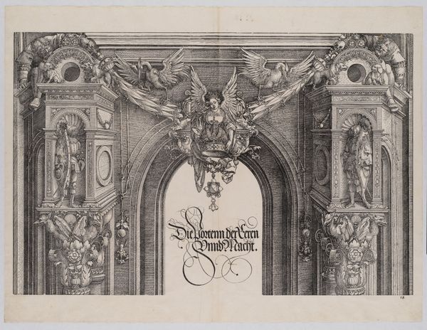
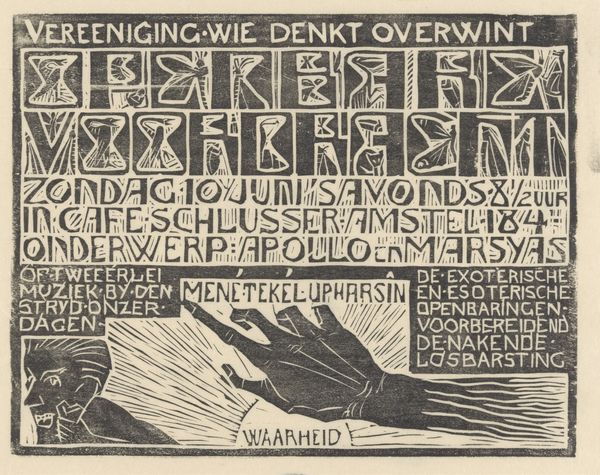
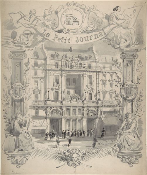
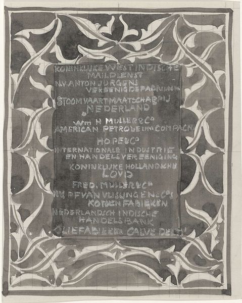
Editor: This is a poster, or "Reclamekaart," for 'Bouw- en sierkunst,' dating from around 1898 to 1935, by Mathieu Lauweriks. It's a very striking typographic image, quite rigid and stylized. There is this Egyptian motif in the form of Isis. I'm curious – what symbols stand out to you, and how do you read them? Curator: The entire composition reads as a temple facade, doesn’t it? And notice how the typography mimics the monumental inscriptions we associate with ancient civilizations. The stylized figures of Isis – or perhaps priestesses embodying Isis – flanking the text are incredibly potent. They represent protection, magic, and motherhood, all intertwined with the idea of creation. Look at what each one holds – the scales signify justice, balance, weighing up of past and future – with the boat above. What could this represent? Editor: It looks like a vehicle transporting someone into another realm or reality. Curator: Precisely. And the globe above the other figure? Knowledge and the expansion of thought? This is not merely advertisement; it's a symbolic portal. The advertisement sells 'Bouw- en sierkunst’ by framing it within an artistic tradition, one tied to enduring themes and ancient wisdom, creating something truly aspirational. Editor: So, the poster invites us to see this journal, "Bouw- en sierkunst," as a gateway? Curator: Yes. Into a deeper understanding of art’s power and the cyclical nature of culture. By implication, through art and architecture, one gains passage through different dimensions of perception. And that lotus flower? Consider that it represents the divine perfection linked to beauty that originates from mud. Editor: That is fascinating. It makes me appreciate the depth of symbolism embedded in what initially seemed like a straightforward advertisement. I would not have noticed that at all without understanding Lauweriks background. Curator: Indeed. By recognizing these visual cues, we grasp the continuity of human creativity and the eternal allure of beauty in both the built environment and ornamentation.
Comments
No comments
Be the first to comment and join the conversation on the ultimate creative platform.
