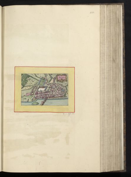
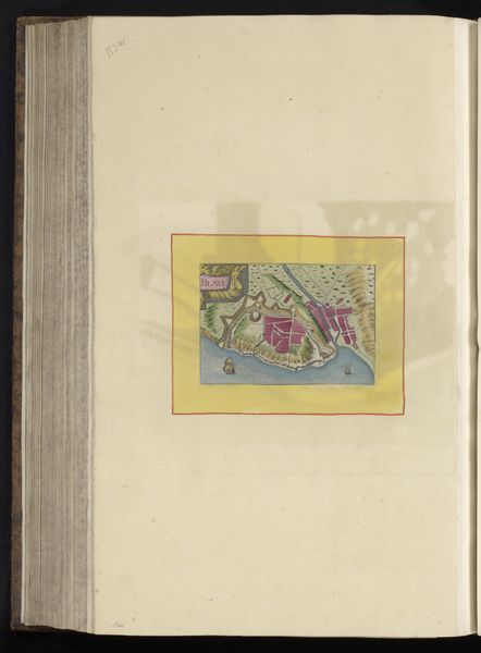
painting, watercolor
#
baroque
#
painting
#
landscape
#
watercolor
#
watercolour illustration
#
watercolor
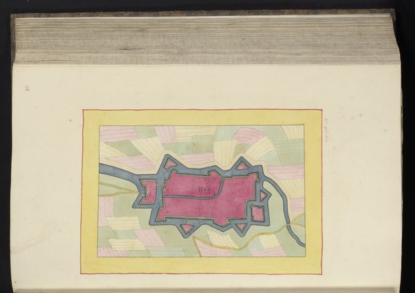
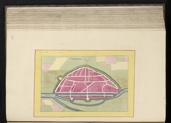
Dimensions: height 174 mm, width 278 mm, height 532 mm, width 319 mm
Copyright: Rijks Museum: Open Domain
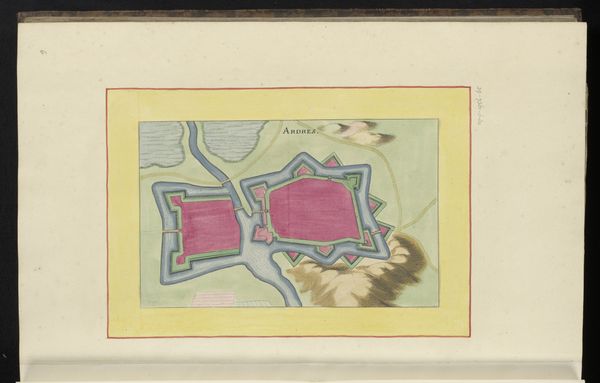
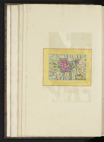
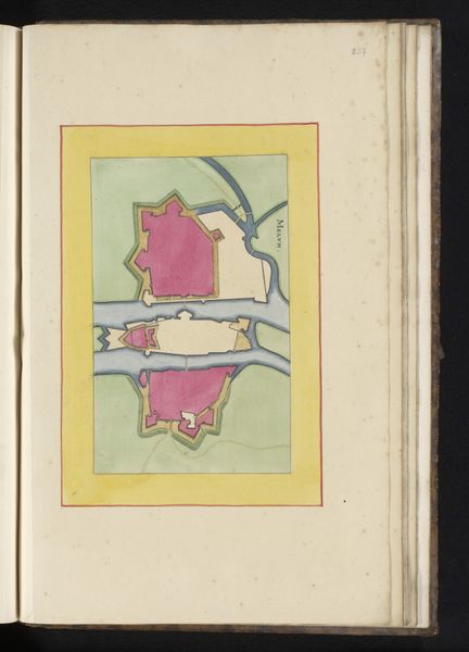
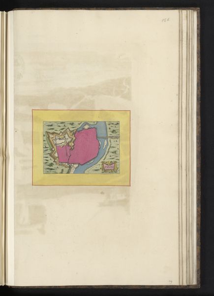
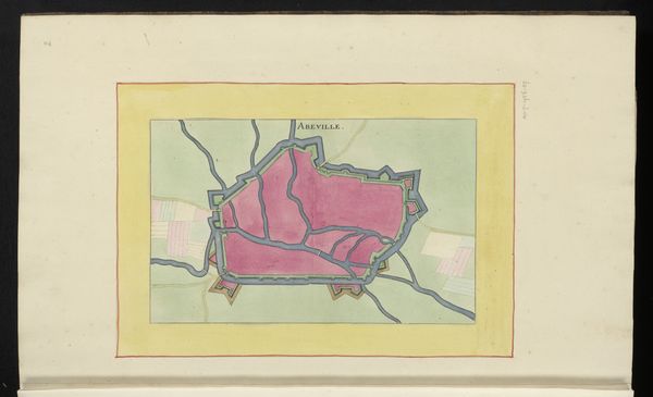
Editor: This watercolour illustration, a map of Amiens from 1656, is fascinating. It’s not just geographical; it has a definite personality. The use of colour feels deliberate, even symbolic. What stories can we unpack here? Curator: The visual vocabulary of a map, even a seemingly technical one, holds cultural memory. See how Amiens is presented within strong ramparts – defence was a key psychological concern. Notice the use of colour, not strictly representational. What does the rose-tinted hue of the city evoke for you? Editor: I suppose the pink does give it a romanticized feeling, maybe a sense of idealized strength, rather than brutal fortification. But does the average viewer from that time see it that way? Curator: That’s precisely the fascinating question! Pink connects it to themes beyond pure functionality, maybe pride or aspiration. Now, consider the radiating lines within the city walls. Editor: Are those supposed to be streets or districts? Curator: Possibly. But think more broadly – radiating lines, sunburst patterns, these are visual shorthands for power, for expansion outward. It elevates the city beyond a mere location to defend; it is a symbolic heart. Even the very precise, architectural drawing suggests a human desire to control and contain. Do you notice anything else? Editor: The sharp, star-shaped structures on the perimeter stand out. So different than the interior layout. Curator: Ah, the bastions! Their geometric form represents a cutting-edge military design, projecting strength and reason onto the surrounding landscape. A powerful message about man versus nature. What have you learned? Editor: The map is not only functional but a cultural and psychological statement. Thank you. Curator: A pleasure; there is always so much more to uncover when looking into our shared visual past!
Comments
No comments
Be the first to comment and join the conversation on the ultimate creative platform.
More like this