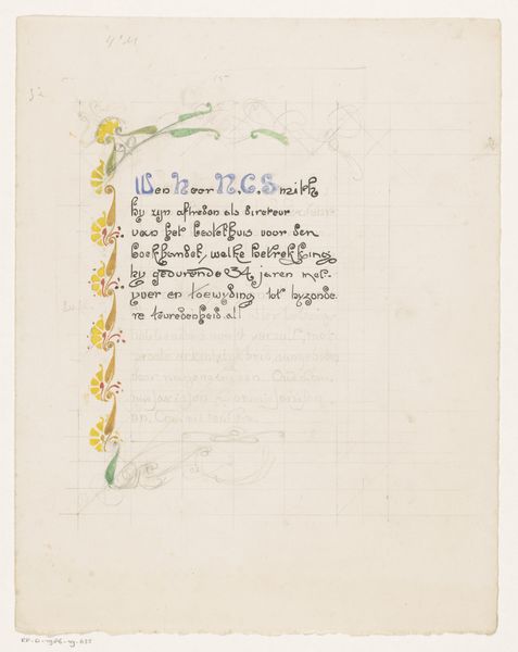
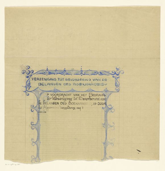
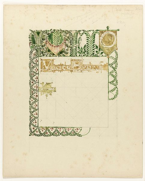
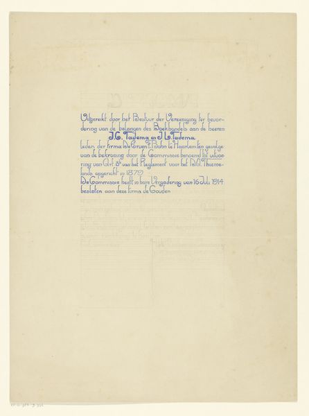
Ontwerp voor een oorkonde van de Vereniging ter Bevordering van de Belangen des Boekhandels 1884 - 1952
0:00
0:00
drawing, mixed-media, paper, ink
#
drawing
#
mixed-media
#
art-nouveau
#
paper
#
ink
#
geometric
#
line
#
decorative-art
#
calligraphy
Dimensions: height 436 mm, width 319 mm
Copyright: Rijks Museum: Open Domain
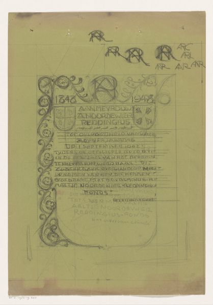
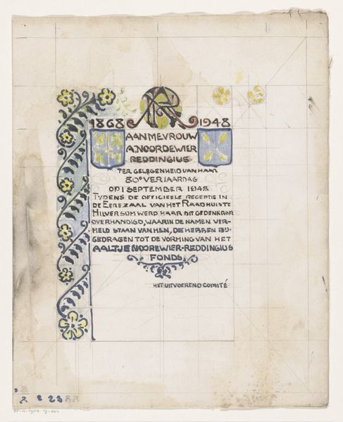
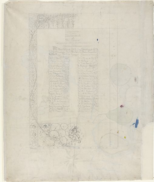
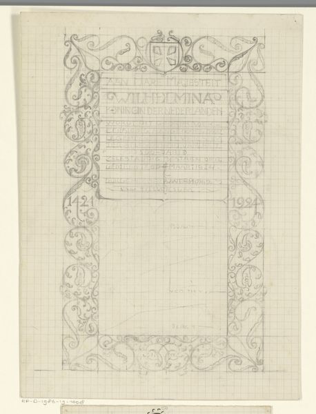
This design for a certificate by Reinier Willem Petrus de Vries involves ink, graphite, and watercolor. It makes me think about how art can be about both the official and the personal. I love the contrast between the precise, almost technical draftsmanship, like the sort of symmetry you find in technical illustration or old maps, and the soft, transparent washes of color. Look at the way the green watercolor softly fills in the space around the central text, or how the gold ink shimmers on the shields at the bottom. It's like the artist is trying to find a balance between structure and fluidity. For me, the appeal lies in its quiet ambiguity; a reminder that things can be formal and loose, serious and playful, all at the same time. It reminds me a bit of Hilma af Klint's work, in that both artists use a visual vocabulary that blends the ornamental with the abstract, creating a space for multiple readings.
Comments
No comments
Be the first to comment and join the conversation on the ultimate creative platform.
More like this