Dimensions: height 342 mm, width 282 mm
Copyright: Rijks Museum: Open Domain
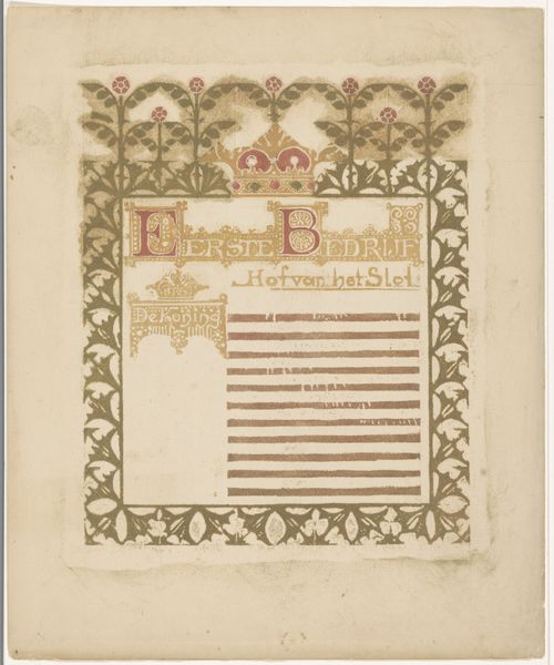
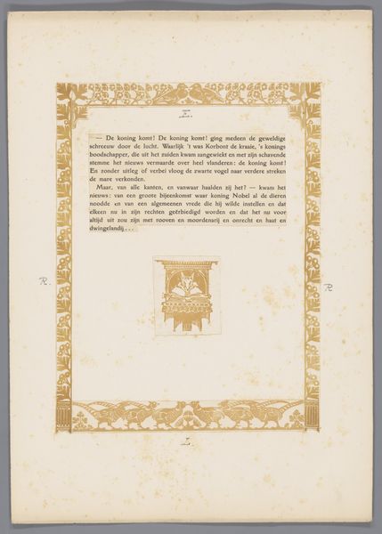
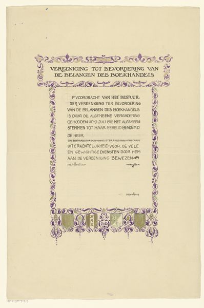
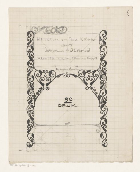
Curator: This is "Ontwerp voor tekst Tweede Bedrijf met ornamenten," created sometime between 1908 and 1937. The artist, Bernard Willem Wierink, used mixed media, including drawing, graphic art, typography and print, to create this design. Editor: My immediate impression is one of aged elegance. The color palette is muted—golds, greys—which contributes to that historical feeling, like something pulled from a well-preserved archive. The gridded construction provides an interesting contrast with the fluid typography and calligraphic flourishes. Curator: The ornamentations are clearly Art Nouveau, drawing from natural forms in a decorative style. The inclusion of heraldic symbols—the crowns and shields—suggests a concern with status and legacy, common themes among elite commissioning patrons. But consider, too, how the integration of text functions within the broader sociopolitical context of the Dutch language, particularly in shaping a distinct cultural identity. Editor: True, but I’m more drawn to the intricacies of the typography. The varying weights of the lines, the serifs, and the deliberate placement on the page create a visual hierarchy. It is like decoding a hidden structure of letters and design. Semiotics may hold the key here to interpreting this interplay between visual form and textual content. Curator: Perhaps. However, without understanding the historical content of that text—the referenced firm and its contributions to the natural sciences—we risk missing how the artwork operates as part of a larger network of knowledge production and dissemination. It’s crucial to see beyond pure form and consider how Wierink was contributing to the world of Amsterdam publishing, and to whose benefit. Editor: But we cannot neglect how his expert penwork leads to optical illusions and detailed expressions. It’s the tension between precision and artistic flourish, like a dance between calculated geometry and graceful imperfection. The eye naturally wants to break down all the visual elements, from the ornamentation and lettering to layout, observing his process as one of thoughtful deliberation. Curator: An important point to highlight to our listeners—this blend of practical design with fine art elevates a piece of everyday typography into an artform expressing the aspirations and connections of its patron or purpose. Editor: It leaves me contemplating how seemingly minor details, through skilled arrangements, can still elicit such curiosity and reflection. A lovely exercise in graphic art that is both simple and intricate.
Comments
No comments
Be the first to comment and join the conversation on the ultimate creative platform.
More like this