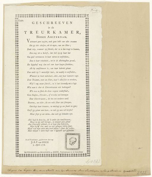
graphic-art, print, typography
#
graphic-art
#
art-nouveau
# print
#
typography
#
decorative-art
Dimensions: height 341 mm, width 252 mm
Copyright: Rijks Museum: Open Domain
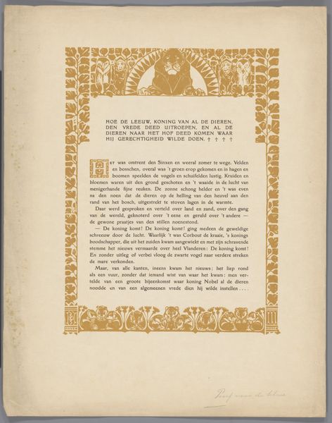
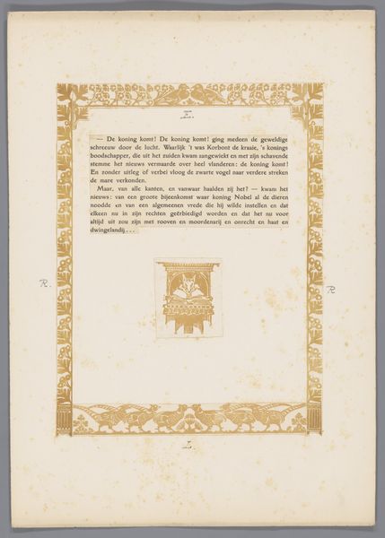
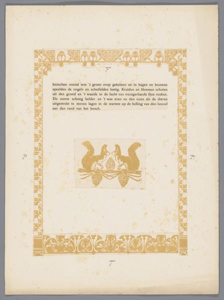
Editor: Here we have a proof page, "Proefdruk voor pagina uit Reinaert de Vos", circa 1910, by Bernard Willem Wierink. It's a print, incorporating graphic art and typography. It has a sort of golden, ornate feel. How does this page strike you? Curator: It feels like stepping into a fable, doesn’t it? That decorative Art Nouveau style, framing the text – it almost wants to escape the confines of the page, climb into our world. What strikes me most is the contrast between the almost whimsical ornamentation and the quite serious text hinting at power struggles amongst animals. It's an allegory playing out. Makes you wonder, doesn't it, about the social commentary Wierink might have intended? Editor: Definitely, the animals in the crest at the bottom also give a fairytale feel. The typography seems very intentional too. Curator: Absolutely, the typography becomes an extension of the visual narrative. See how it anchors the decorative flourishes. If that block of text wasn't there, then it would be completely adrift, utterly decorative. Editor: I see your point, I initially looked at the image without thinking too much about the role of the text. I will be more mindful of the link between word and image from now on. Curator: Yes, now it almost begs to be read aloud, to continue the story. The whole page invites an intimate performance. Don't you think that there's an intentional desire here to engage us, not just as viewers, but as storytellers? Editor: That's a cool thought! I didn't see it that way initially, but now I can appreciate the multifaceted and storytelling aspect of the piece.
Comments
No comments
Be the first to comment and join the conversation on the ultimate creative platform.
More like this