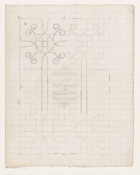
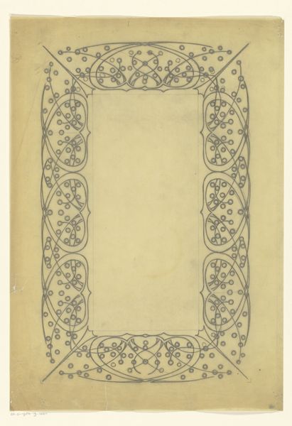
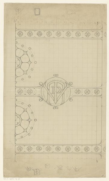
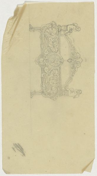
Ontwerp voor een tekstkader voor het Gedenkboek Hilversum 1424-1924 1924
0:00
0:00
Dimensions: height 243 mm, width 175 mm
Copyright: Rijks Museum: Open Domain
Editor: This is "Ontwerp voor een tekstkader voor het Gedenkboek Hilversum 1424-1924," a design for a text frame from 1924, made by Reinier Willem Petrus de Vries using pencil on paper. It feels very intricate but also unfinished, like a glimpse into the artist's process. What stands out to you in terms of composition and form? Curator: The pencil drawing immediately emphasizes line and form, a crucial first step. The underlying grid structure is openly visible. What strikes me first is how the ornamentation is designed to interact with that pre-existing grid. The ornamental flourishes don’t simply exist on the page; they negotiate and sometimes even fight against it. Notice, for instance, the crest at the very top fighting to emerge. It pushes against the rigid confines beneath. Editor: It’s interesting that you focus on that tension! I was initially drawn to the Art Nouveau aspects. The organic, flowing lines create such an elegant framework. Curator: The style’s superficial attractiveness almost masks its calculated formalism. Consider the use of negative space, the intentional voids in the design, how it frames and punctuates the text block. This tension forces our attention, no? It is a carefully calibrated composition designed to bring both structure and style. Editor: I see that now, the grid and ornamentation play off each other. Thanks, I never thought to consider it that way before. Curator: Art’s inherent duality offers layers; keep seeking those interplays. It will help with analyzing future compositions, designs, and drawings.
Comments
No comments
Be the first to comment and join the conversation on the ultimate creative platform.
More like this