Dimensions: height 319 mm, width 217 mm
Copyright: Rijks Museum: Open Domain
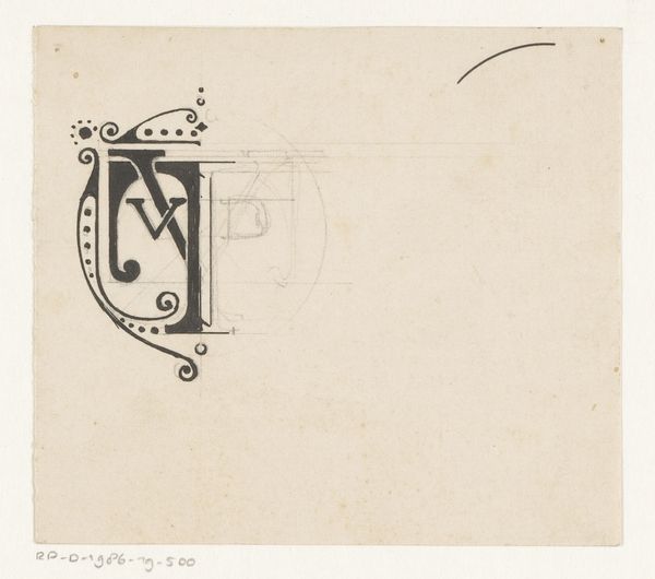
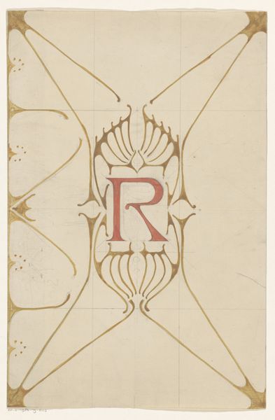
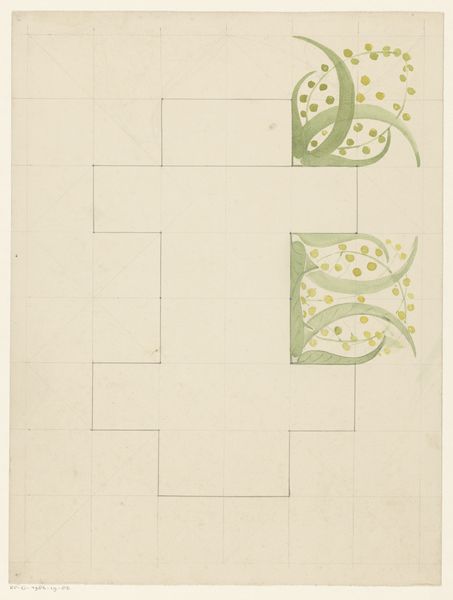
Reinier Willem Petrus de Vries made this monogram, JCK, with pencil and crayon, but I don't know exactly when. What strikes me is the provisionality of it, how it invites us into the process of making. The drawing has a light touch, quite literally. The colours are pale, and the marks are delicate, revealing the paper’s surface underneath. It's like looking at a ghost of a design, a whisper of an idea. I see the initial sketch in the background, underneath the main design. I love the way the drawing shows the scaffolding of the process, the under-drawing still visible. This feels like the work of someone playing with form. I am reminded of Hilma af Klint’s preparatory drawings, but also the way Eva Hesse would build up forms from the inside, letting the process determine the outcome. It tells us that art is an ongoing conversation. We learn from what has come before and respond with our own voice.
Comments
No comments
Be the first to comment and join the conversation on the ultimate creative platform.
More like this