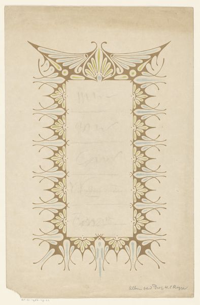
drawing, paper, ink
#
drawing
#
art-nouveau
#
paper
#
ink
#
geometric
#
symbolism
#
decorative-art
Dimensions: height 414 mm, width 295 mm
Copyright: Rijks Museum: Open Domain
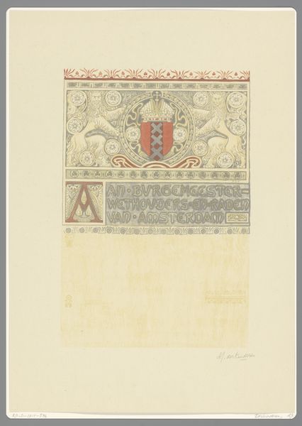
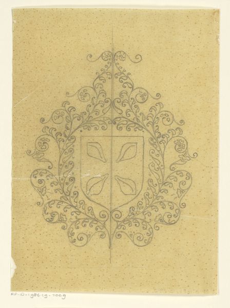
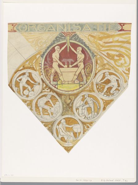
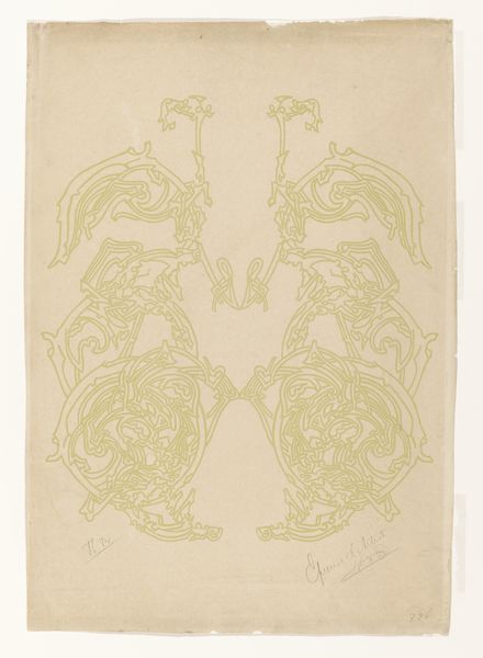
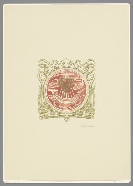
Editor: This is "Poëzie, architectuur, tooneel, schilderkunst, muziek" by Antoon Derkinderen, created between 1894 and 1901 using ink and paper. The symmetry and delicate lines give it a very decorative, almost heraldic feel. What draws your eye when you look at this piece? Curator: My immediate focus is drawn to the meticulous geometric structure underlying the decorative elements. Note the artist’s considered placement of line and form, particularly in how the radiating semi-circle interacts with the cruciform shape below. The use of positive and negative space is especially compelling. How do these formal choices contribute to the overall composition, would you say? Editor: I think it gives the piece a balanced, organized feel, preventing the ornate details from becoming overwhelming. It's interesting how the title speaks to multiple art forms, but the structure seems so unified. What would you say the function of that central red shield might be, formally speaking? Curator: Observe how the limited colour palette—the soft yellows and greys, punctuated only by that sharp red—establishes a focal point while maintaining a sense of harmonious restraint. The shield provides a clear center to the radiating composition; it is at once the keystone and a stark contrast to the textured ornamentation surrounding it. Does it strike you as arbitrary, or intentionally integral? Editor: Seeing it that way, I understand that it feels completely integrated, not just decorative, and central to the overall formal structure of the work. Thank you. Curator: Indeed, the success of the artwork is in the considered manipulation of each individual element, working to reinforce the core of the aesthetic idea. A fruitful observation.
Comments
No comments
Be the first to comment and join the conversation on the ultimate creative platform.
More like this