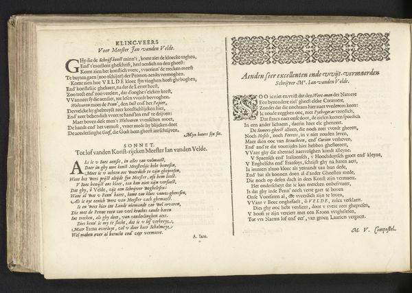
1565
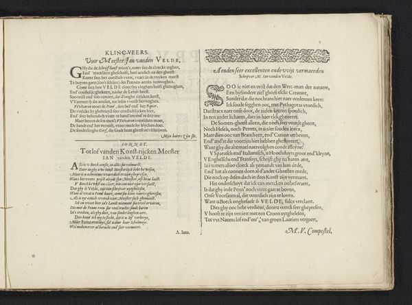
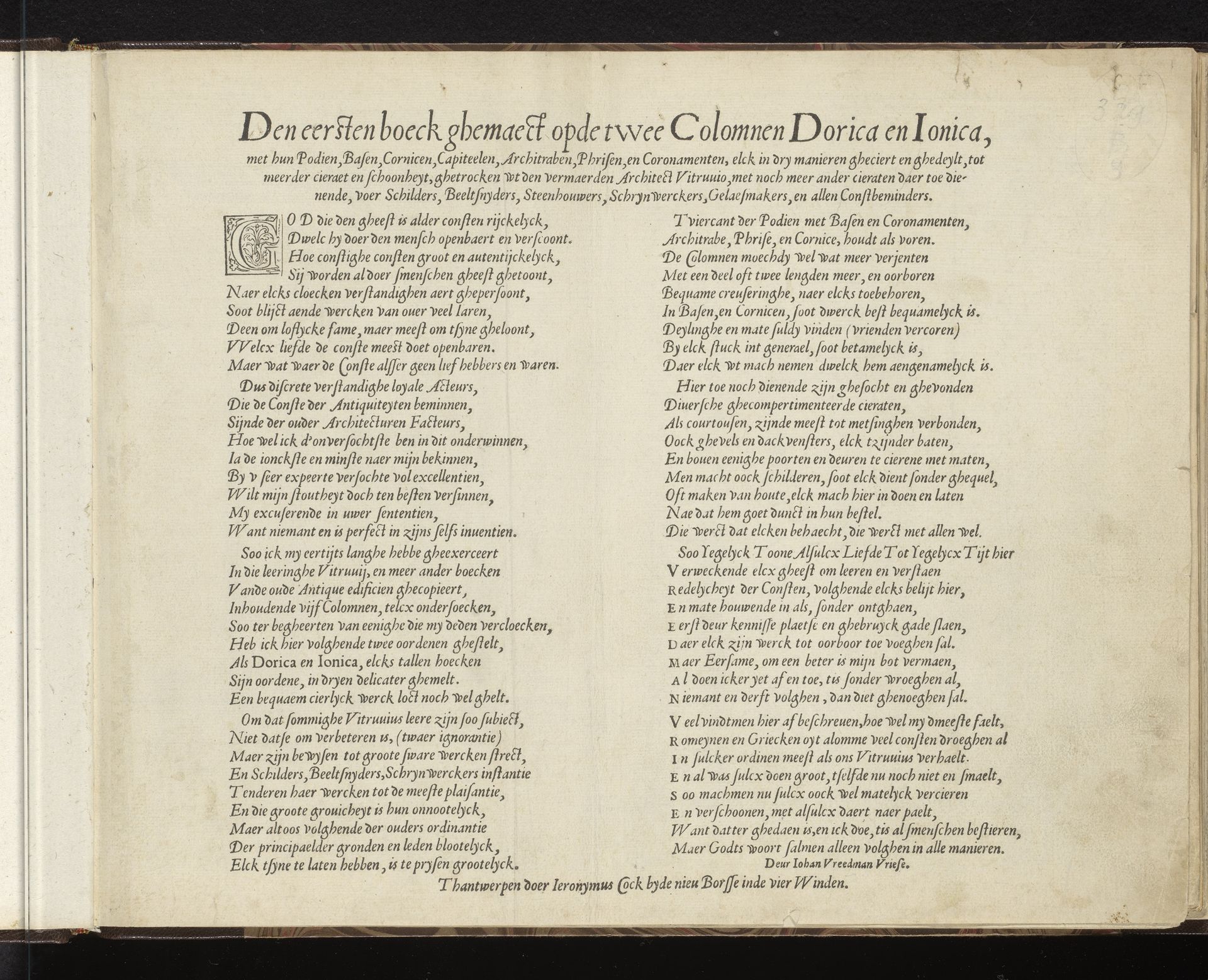
Titelpagina voor: Den eersten boeck ghemaeckt opde twee Colomnen Dorica en Ionica
Hans Vredeman de Vries
1527 - 1606Location
RijksmuseumListen to curator's interpretation
Curatorial notes
Curator: Here at the Rijksmuseum, we have a striking title page from 1565, "Titelpagina voor: Den eersten boeck ghemaeckt opde twee Colomnen Dorica en Ionica," by Hans Vredeman de Vries. It's an intricate example of 16th-century typography. Editor: My first thought? It's wonderfully dense! A tightly packed visual experience with this antique script and a sense of profound visual gravity. What's it about? Curator: It's a title page intended for the first book about Doric and Ionic columns, discussing their bases, cornices, capitals and more, reflecting on the architectural style of Vitruvius. Vredeman de Vries was an expert at this. Editor: Columns… Yes, the script typeface imitates the concept. Look at the aged paper; the whole piece has a crumbling architectural feel as if these architectural elements themselves are decaying. Do the words mirror the construction and…destruction? Curator: I would say this typography is really demonstrating a transition in script design; notice the almost 'sand-serif' quality to it—it isn't quite a complete departure from older styles but indicates emerging aesthetics of that era, the Renaissance. It’s not simply functional; it is ornamental. Editor: So, each stylistic component creates cultural and psychological echoes; its imagery connects to ideas of knowledge, preservation, and maybe a tinge of loss because of the implied crumbling. This balance feels characteristic of Renaissance anxieties, no? A kind of beautiful decay… Curator: I agree; Vredeman de Vries masterfully used typography here; his script and dense formatting are designed not only to grab attention but communicate content fitting to the subject of architecture and antiquity that feels entirely congruent with the values of 16th century society. Editor: It's quite amazing to think how much meaning and cultural insight can be packed onto a single page through visual and symbolic choices. I had come to similar conclusions examining it strictly visually. Curator: Indeed. This piece showcases how Renaissance artists intertwined visual presentation and informational context in profound ways, something worthy of further appreciation!