print, paper, typography
# print
#
paper
#
11_renaissance
#
typography
#
historical font
Dimensions: height 260 mm, width 370 mm
Copyright: Rijks Museum: Open Domain
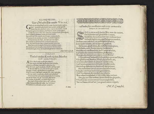
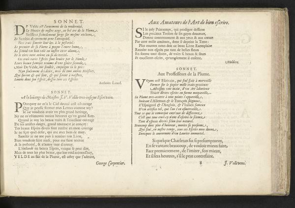
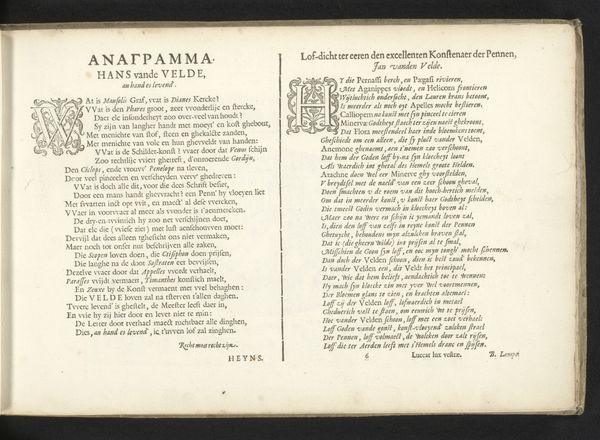
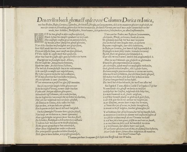
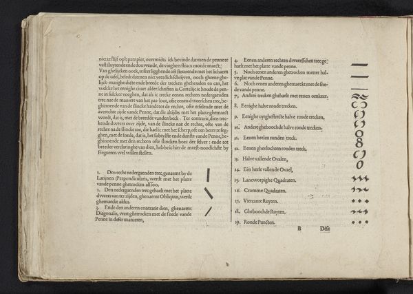
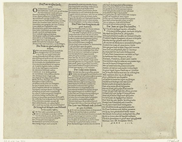
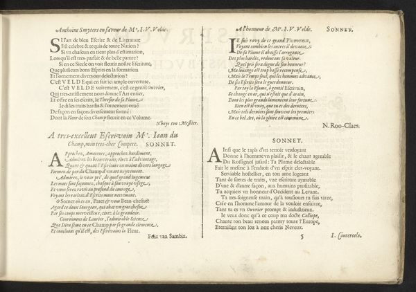
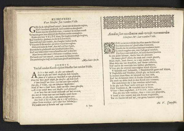
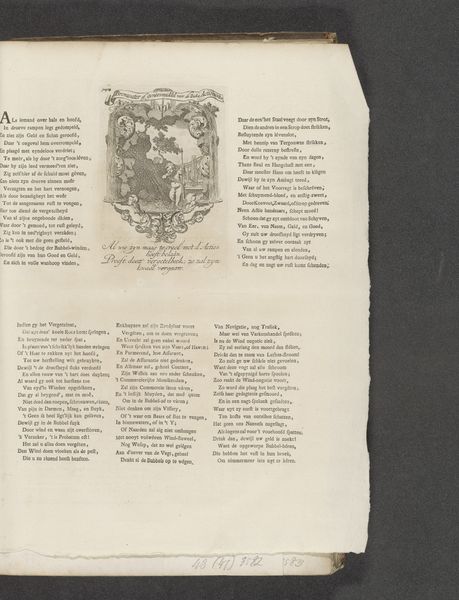
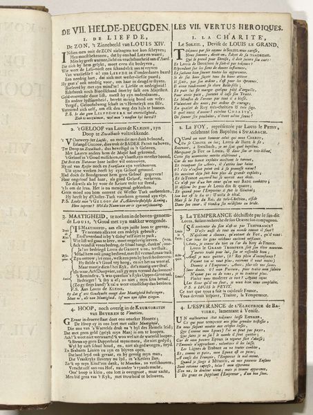
This is a page of poetry made in the Netherlands, sometime around 1600 by Zacharias Heyns. It’s printed with moveable type—a technology then a little over a century old. If we look closely, we can see the individual letters pressed into the page. This was a revolutionary method of production because it allowed identical copies to be made quickly. The technology democratized knowledge, making books cheaper and more available to a wider public. But we should also think about the work that went into this page, and how labor and class might appear in it. Each character had to be individually cast, composed by hand, and carefully proofread. The words, in a very real sense, are made. Though printed, this page also shows that the work of writing and distributing poetry was highly specialized and skilled. Considering materials, making, and historical context helps us understand the full meaning of this work. It challenges traditional distinctions between fine art and craft, and opens up a new perspective on the relationship between art, labor, and society.
Comments
No comments
Be the first to comment and join the conversation on the ultimate creative platform.
More like this