print, paper
#
medieval
# print
#
paper
Dimensions: height 315 mm, width 200 mm
Copyright: Rijks Museum: Open Domain
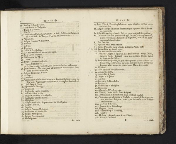
Curator: Here we have “Inhoudsopgave voor Roma Pertubata, 1706” a print on paper by Carel Allard, dating back to around 1706 or 1707. It resides in the collection of the Rijksmuseum. Editor: Yes, it feels really dense and almost claustrophobic with all that tightly packed text. What’s your eye drawn to first when you look at this work? Curator: Immediately, the bilateral symmetry asserts itself—the composition, bisected, demands a comparative reading. Note how Allard uses the book's gutter as a visual spine. Can you discern the implied relationship between these two fields of text? Editor: It's like each page is mirroring the other, yet they both contain distinct information… Almost like comparing contrasting points. Curator: Precisely. This is where form mirrors content. Look closely—can you detect any repeated visual motifs or structural elements? What effect do they produce? Editor: Well, each numbered section begins with that bold capitalized descriptor... "ZINNEBEELD". They guide your eye. Are they some kind of key to decode this print? Curator: A perceptive observation. Indeed, "Zinnebeeld" translates roughly to "emblem" or "allegory." Thus, we aren’t merely seeing text, but a structured system of symbolic representation, guiding the viewer toward deeper meaning embedded within each numbered declaration. Each declaration, and by extension, the whole work. What is gained or lost through its composition, though? Editor: Seeing the structural elements helps contextualize what otherwise feels overwhelming and unstructured. I think I’m starting to get the allegory that binds everything! Curator: Indeed. An allegorical catalogue designed to be dissected through textual and structural analyses!
Comments
No comments
Be the first to comment and join the conversation on the ultimate creative platform.
More like this