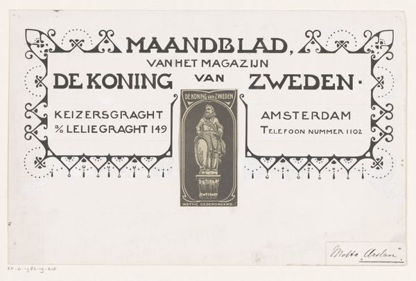
print, typography, poster
#
script typeface
#
type repetition
#
sand serif
#
aged paper
#
art-nouveau
#
script typography
# print
#
typography
#
thick font
#
handwritten font
#
golden font
#
classical type
#
poster
#
historical font
Copyright: Rijks Museum: Open Domain
Curator: This is an invitation poster, predating 1904, for an exhibition of works by Walter Crane. It was displayed at the Museum van Kunstnijverheid in Haarlem. I am fascinated by how institutions frame artists for public consumption. Editor: My first impression? Elegant and restrained. There's a certain weightiness to the typeface and layout. I immediately notice the careful distribution of text; the rigid uppercase of 'Museum van Kunstnijverheid', compared with the looser, decorative typography used to spell out 'Uitnodiging' and 'Walter Crane'. It feels… curated. Curator: The Art Nouveau aesthetic is definitely in play here, nodding to Crane’s artistic position at the time. I find it particularly telling to see the organizational roles acknowledged in the poster. Editor: Absolutely, the inclusion of those names reinforces the power dynamics inherent in artistic representation. This poster itself acts as a visual marker within the social matrix of the museum institution. The choice of typefaces, for example, dictates the kind of status and reverence invited from viewers. What are we seeing, when 'DEZE KAART IS PERSOONLIJK'? Whose experience really matters here? Curator: A critical question, always. The typeface serves a dual function, doesn't it? Communicating both the invitation itself but also reflecting the institution’s perceived image. This aesthetic elevated certain audiences whilst alienating others. It is essential to remember that museums often construct and maintain power dynamics through this. Editor: It does. But perhaps that “persoonlijk” aspect offers a subtle opening for viewers to engage critically, questioning the exclusivity encoded into cultural events like this exhibition? And where is Crane in this invitation? Curator: Interesting thought, although this feels optimistic. Crane’s voice, or rather his art, is already filtered, pre-packaged, to appeal to a certain gaze sanctioned by both institution and secretary Von Saher here at the Museum. Editor: An important point, one that reminds us how even invitations carry the weight of institutional narratives and biases. Seeing it, however, also brings into question art historical canon making and contemporary accessibility to cultural heritage today. Curator: Indeed. And it shows just how much a simple invitation like this reveals about the forces shaping artistic visibility and historical understanding. Editor: Food for thought about the stories museums and cultural artefacts silently reinforce, even today.
Comments
No comments
Be the first to comment and join the conversation on the ultimate creative platform.
More like this