graphic-art, print, typography, poster
#
graphic-art
#
art-nouveau
#
script typography
#
hand-lettering
#
dutch-golden-age
# print
#
playful lettering
#
hand drawn type
#
hand lettering
#
word art
#
typography
#
hand-drawn typeface
#
thick font
#
handwritten font
#
poster
#
small lettering
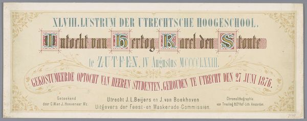
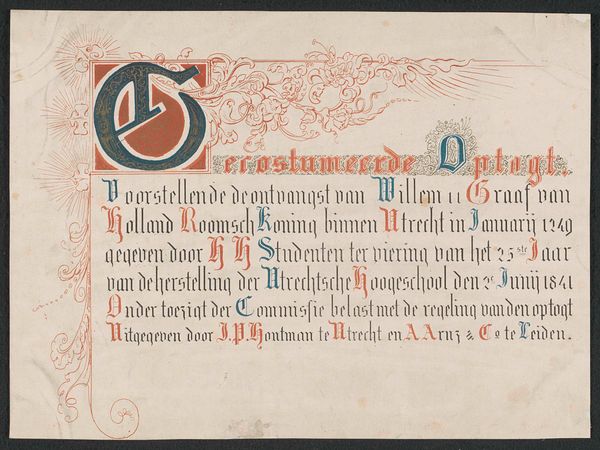
Dimensions: height 335 mm, width 865 mm
Copyright: Rijks Museum: Open Domain
Curator: It’s fascinating how typography can act as a mirror, reflecting social and historical currents. What’s your take on this particular example? Editor: This is "Utrechtse maskerade van 1886 (omslag)" a poster made in 1886 by J.L. Beijers. The text is ornate, almost aggressively decorative. It feels… celebratory? But also a bit imposing, given the font. What do you see in it? Curator: I see a very deliberate construction of identity. This isn’t just any font; it's a self-conscious invocation of the past. The piece celebrates the 250th anniversary of Utrecht University through a "costumed procession," suggesting a performance of history. How do you think this performance, and the typography itself, constructs a narrative of Dutch identity at that time? Editor: I guess it’s trying to create a sense of legitimacy, drawing on this idea of a long and storied past for the university and the Netherlands itself. The font, it's like they’re trying to connect themselves to some kind of… medieval grandeur? Curator: Precisely! It's interesting to note how often nations invoke an imagined past to legitimize their present. Consider the tensions within Dutch society at this time – growing industrialization, burgeoning class consciousness. This poster, in its romanticized depiction of history, can be seen as a counter-narrative, reaffirming traditional hierarchies and values. Editor: So, it’s not just celebrating an anniversary, it’s making a statement? Sort of like a… carefully crafted PR campaign? Curator: Absolutely! By visually linking the university to these historical events—the Union of Utrecht, the Founding of the University, and the Peace of Utrecht—it’s also asserting its continued relevance and authority in a rapidly changing world. This invites reflection upon what purposes institutions such as universities fulfill during times of national transformation and whether universities even challenged established norms at this time or if the universities instead reinforced the status quo. Editor: Wow, I never thought about typography having such a powerful social purpose. I just thought it looked kind of fancy. Curator: That's the beauty of engaging with art. What seems decorative on the surface often holds layers of meaning about power, identity, and the ongoing negotiation of who we are as a society. Editor: Thanks. I'll never look at a poster the same way again!
Comments
No comments
Be the first to comment and join the conversation on the ultimate creative platform.
More like this