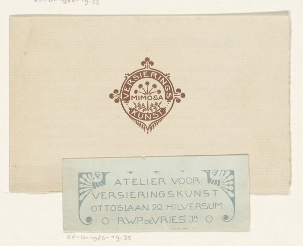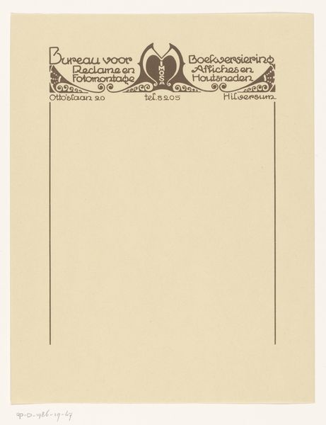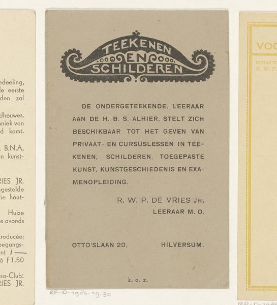
1884 - 1952
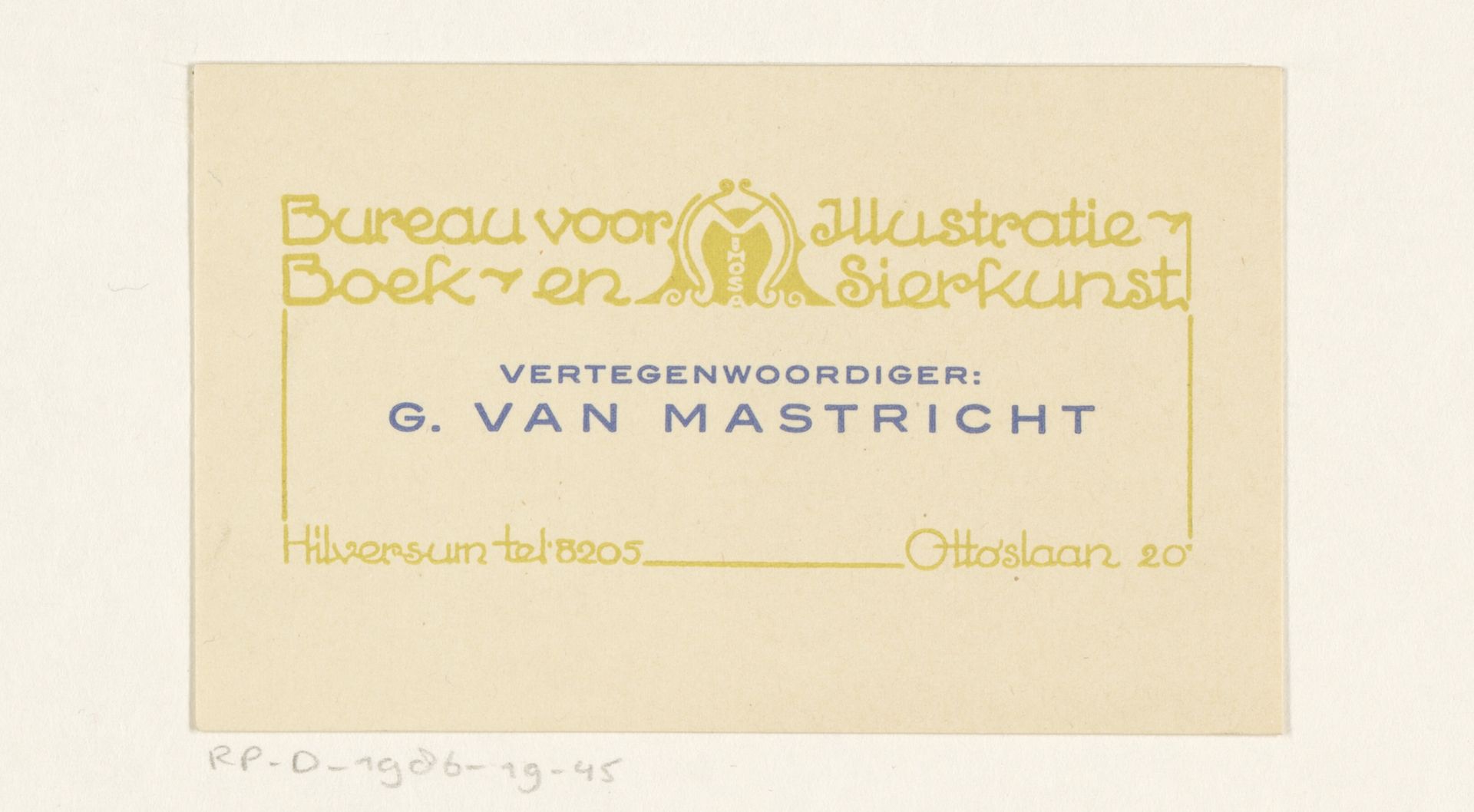
Visitekaartje van Bureau voor Illustratie, Boek- en Sierkunst Mimosa
Listen to curator's interpretation
Curatorial notes
Curator: Let’s have a closer look at this "Visitekaartje van Bureau voor Illustratie, Boek- en Sierkunst Mimosa"—a visiting card dating from sometime between 1884 and 1952 and designed to advertise an illustration bureau. My initial impression is one of refined restraint; the muted colors give it a sort of old-world formality. Editor: It's interesting how the production of art, even its promotion, can be seen as art itself here. The choice of simple typography and colors reflects a functional approach to communicating information in an accessible and affordable way. Curator: Agreed, and that is what strikes me. This card makes potent use of symbolism despite being relatively pared down. Notice the interwoven 'M' within the central graphic—undoubtedly a reference to ‘Mimosa’, lending the design an almost heraldic quality that conveys brand identity. The script dances between clarity and flair. Editor: Exactly, there’s no superfluous design, it simply conveys its function effectively. By examining materials and techniques we see a clear prioritization on clear printing in a time with limited widespread availability and use of different processes or mediums. Curator: We're seeing a business embracing art nouveau aesthetics to associate itself with current styles of visual culture. Even a simple business card aims to create an atmosphere! The implied message is clear; this bureau will bring artistry into commercial endeavors. Editor: And we also see the emergence of specialization within the field; a "bureau" dedicated to illustration, book arts, and decorative arts signifies increasing professionalization within the art industry and labor divisions, moving art closer to being an actual form of industry. Curator: That’s right—and there is a deeper echo. The very act of commissioning such a design points to evolving modes of professional self-representation. It shows an attention to crafted image that was becoming crucial in connecting businesses with audiences. Editor: Indeed. Thinking about it, this little card says so much about the shifts in cultural attitudes to artistic labor at the time. Curator: It definitely captures the transition into more deliberately branded communication. The symbolic language still speaks clearly to us, even now. Editor: Well said, by considering material history alongside social changes we can read so much out of the piece.