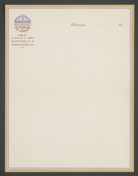
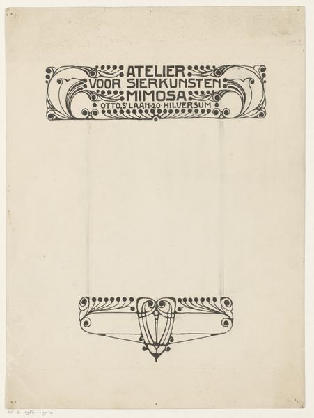
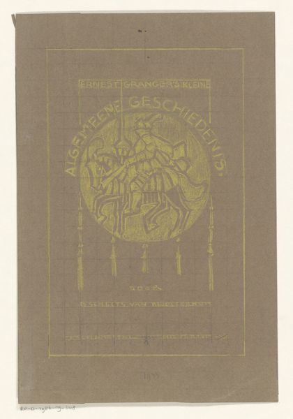
Briefpapier van Bureau voor Boekversiering Mimosa 1884 - 1952
0:00
0:00
graphic-art, paper, typography
#
graphic-art
#
art-nouveau
#
paper
#
typography
#
geometric
#
line
#
decorative-art
Dimensions: height 275 mm, width 215 mm
Copyright: Rijks Museum: Open Domain
Reinier Willem Petrus de Vries made this letterhead for his Bureau voor Boekversiering Mimosa, using print. The design lives in the details. It’s restrained and decorative, the way it sits on the page, all balanced. It makes me think about how something simple can be so effective. The brown ink is earthy and rich. It feels like it was custom made for this purpose, the design is clean and efficient, and I notice the swirls that separate the text, but also unite it as a whole. I love how the thin lines of the margins almost disappear into the paper. The letter M in the centre looks almost like a butterfly. There's a real joy in finding pleasure from the act of making. The piece reminds me of the work of graphic designer Alvin Lustig, they share that attention to detail and love of playful typography. I find that artwork like this always gives you something new to see, a different perspective.
Comments
No comments
Be the first to comment and join the conversation on the ultimate creative platform.
More like this