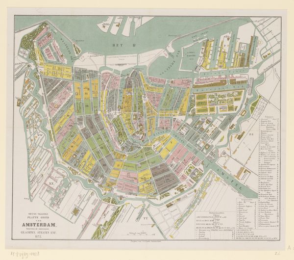
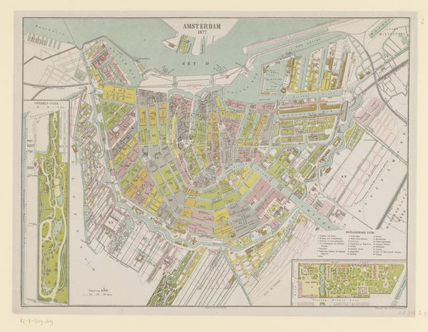
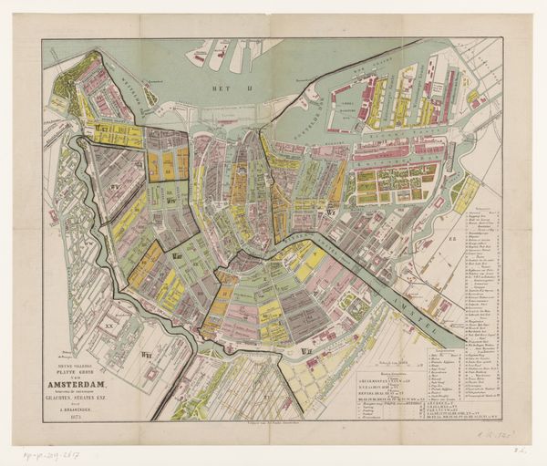
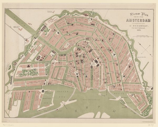
Reproductie van een plattegrond van Amsterdam met politiebureaus en brandweerposten aangegeven 1895
0:00
0:00
drawing, print
#
drawing
#
map drawing
# print
#
architectural drawing
#
cityscape
Dimensions: height 494 mm, width 637 mm
Copyright: Rijks Museum: Open Domain
Curator: This is a reproduction of a map of Amsterdam, circa 1895, highlighting police stations and fire brigade locations. It’s rendered as a print or a drawing. Editor: It's meticulously detailed! My first impression is the feeling of order it conveys—every street and canal precisely rendered, even a calm institutional oversight made visible. Curator: Precisely. This map provides an insight into the civic structures and control mechanisms operating in Amsterdam at the end of the 19th century. It speaks to the rise of bureaucracy, but also to the city's growing concerns about public safety and order during rapid urbanization. The deliberate highlighting of these emergency services underscores anxieties linked to overcrowding and potential social unrest. Editor: Absolutely. The deliberate visual hierarchy—police stations marked with bold circles, fire stations with smaller points—reveals something of the cultural mindset. What anxieties did fire represent, and in contrast, how were crime and policing understood at this moment? And what is the meaning imbued into the locations of those centers of security? Curator: We must consider the visual grammar it employs. Notice how the information is structured by sector. Who were the imagined audience of such publications at that time? Was it meant for administrative use, to orient those newcomers who contributed to an evolving social landscape, or serve as a document to showcase municipal responsibility? This map functioned to regulate, shape perceptions, and exert spatial power within urban Amsterdam. Editor: I'm struck by the map’s colour palette - muted greens for waterways, and brick reds and pinks designating municipal strongholds. I can imagine it hanging, a reassuring presence for concerned citizens. It is designed not just to inform but also to emotionally reassure the beholder of civic resilience and responsibility. The map acts almost as an emotional support system! Curator: Indeed! We begin to realize the depth these simple diagrams contain. It's an intersection between control and assurance, reflecting historical power structures. Editor: From its carefully crafted symbolism, we learn much about Amsterdam's self-image during times of growth and tension. Curator: That’s what makes studying something as "simple" as a map quite revealing when we think of broader meanings.
Comments
No comments
Be the first to comment and join the conversation on the ultimate creative platform.
More like this