About this artwork
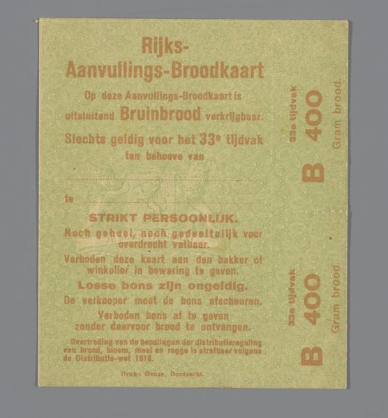
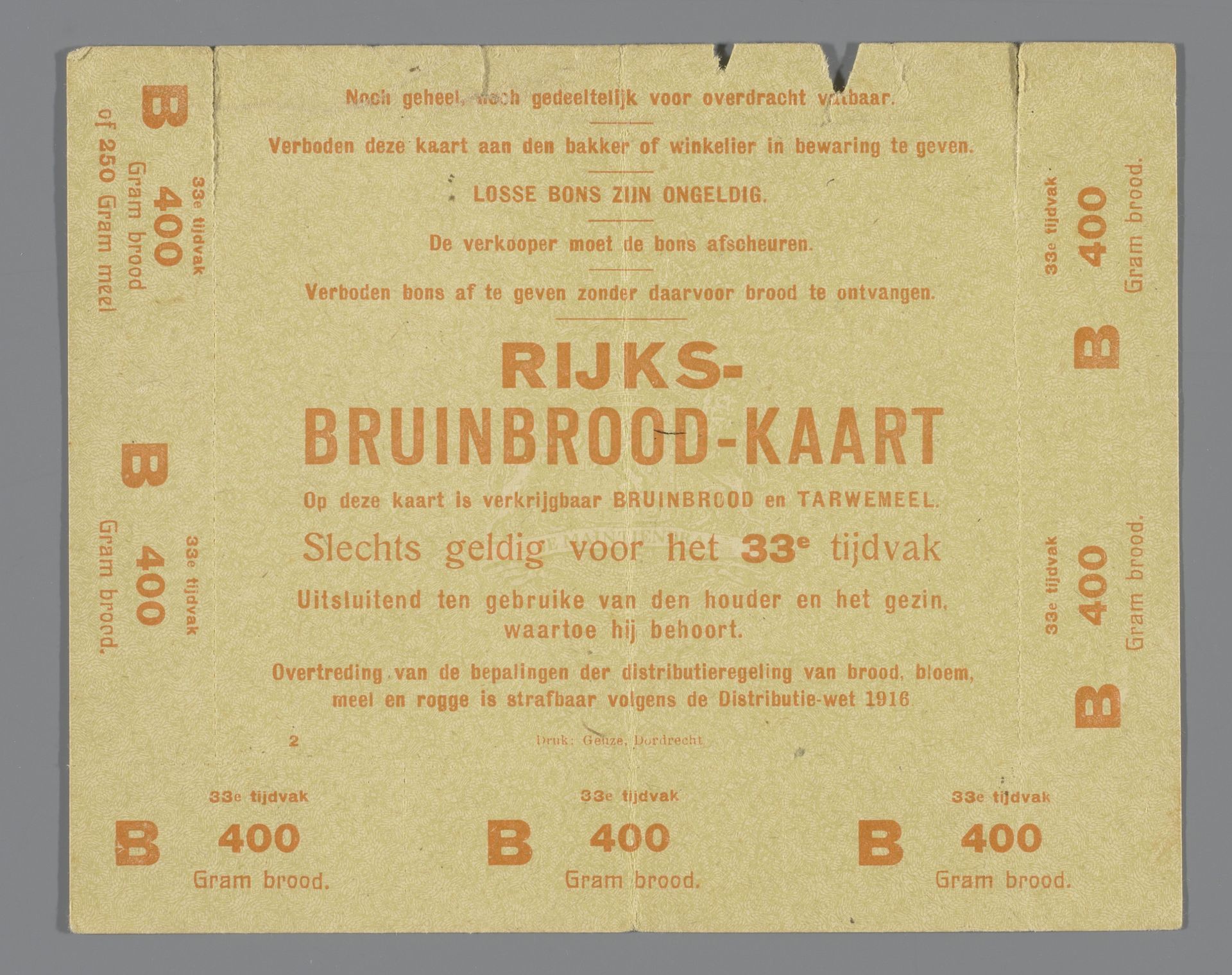
This "Rijksbruinbrood-kaart" – a bread ration card – was printed during a time of scarcity, though the exact date is unknown. The design is utilitarian, like a proto-conceptual artwork. Look at the typography, it’s repetitive and functional, yet there’s an undeniable visual rhythm in the layout. The warm, earthy tones speak to the subject of bread, sustenance, a basic need. The perforations suggest the card was designed to be torn apart, used, consumed. It reminds me of some of Ed Ruscha's word paintings but with a more bureaucratic, less poetic sensibility. The Dutch design collective, Geuze & Co, whether they considered themselves artists or not, engaged in a form of visual communication that transcends its original purpose. It’s a reminder that art can be found in the most unexpected places, and that even the most mundane objects can offer insights into our history and culture. Art is about seeing, right? This card makes you see!
Artwork details
- Medium
- print, textile, paper, typography, poster
- Dimensions
- height 12 cm, width 15 cm
- Copyright
- Rijks Museum: Open Domain
Tags
Comments
Share your thoughts
About this artwork
This "Rijksbruinbrood-kaart" – a bread ration card – was printed during a time of scarcity, though the exact date is unknown. The design is utilitarian, like a proto-conceptual artwork. Look at the typography, it’s repetitive and functional, yet there’s an undeniable visual rhythm in the layout. The warm, earthy tones speak to the subject of bread, sustenance, a basic need. The perforations suggest the card was designed to be torn apart, used, consumed. It reminds me of some of Ed Ruscha's word paintings but with a more bureaucratic, less poetic sensibility. The Dutch design collective, Geuze & Co, whether they considered themselves artists or not, engaged in a form of visual communication that transcends its original purpose. It’s a reminder that art can be found in the most unexpected places, and that even the most mundane objects can offer insights into our history and culture. Art is about seeing, right? This card makes you see!
Comments
Share your thoughts