About this artwork
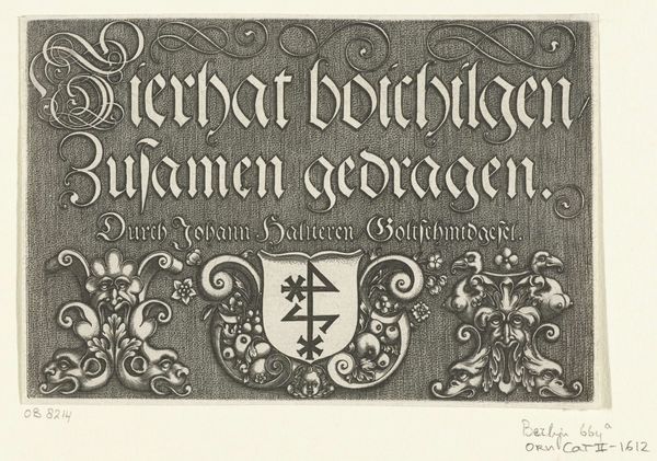
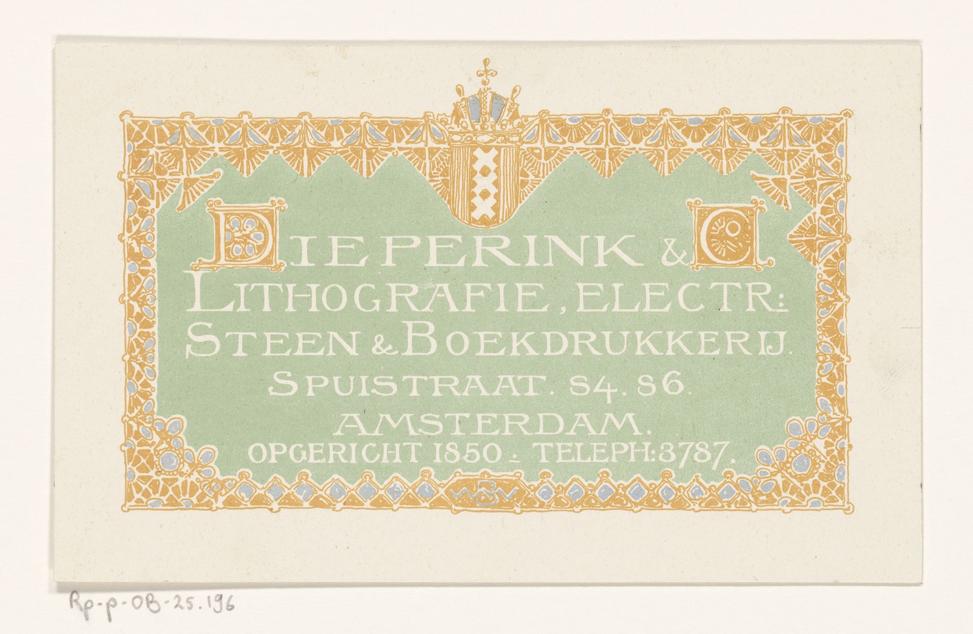
This business card for Dieperink & Co was made by Bernard Willem Wierink; it’s a lithograph, so ink on paper, the kind of thing that gets made in multiples. The way the image is built up – the lettering and decoration – it looks like it’s been made up from lots of separate components, carefully arranged. I love the way that these small elements combine. It’s a bit like jazz: each shape, each line, is doing its own thing, but it comes together as a whole. See that curly, almost Celtic ‘D’ in ‘Dieperink’. It’s like a miniature painting in itself, that initial, all scrolls and curlicues. There’s a decorative border, which seems to me like lace, or jewelry. And then the Amsterdam crest is at the top, like a kind of official seal. The colors are muted – creams, greens, blues – but they add to the overall effect of quiet elegance. It makes me think of the work of someone like Hilma af Klint, the way that design can be an invitation to think about the world in different ways.
Visitekaartje voor Dieperink & Co 1866 - 1939
Bernard Willem Wierink
1856 - 1939Location
RijksmuseumArtwork details
- Medium
- graphic-art, print, poster
- Dimensions
- height 109 mm, width 175 mm
- Location
- Rijksmuseum
- Copyright
- Rijks Museum: Open Domain
Tags
graphic-art
art-nouveau
old engraving style
retro 'vintage design
decorative-art
poster
Comments
No comments
About this artwork
This business card for Dieperink & Co was made by Bernard Willem Wierink; it’s a lithograph, so ink on paper, the kind of thing that gets made in multiples. The way the image is built up – the lettering and decoration – it looks like it’s been made up from lots of separate components, carefully arranged. I love the way that these small elements combine. It’s a bit like jazz: each shape, each line, is doing its own thing, but it comes together as a whole. See that curly, almost Celtic ‘D’ in ‘Dieperink’. It’s like a miniature painting in itself, that initial, all scrolls and curlicues. There’s a decorative border, which seems to me like lace, or jewelry. And then the Amsterdam crest is at the top, like a kind of official seal. The colors are muted – creams, greens, blues – but they add to the overall effect of quiet elegance. It makes me think of the work of someone like Hilma af Klint, the way that design can be an invitation to think about the world in different ways.
Comments
No comments