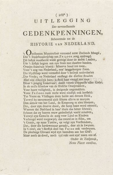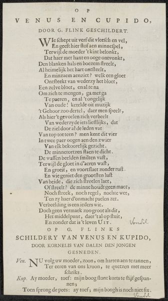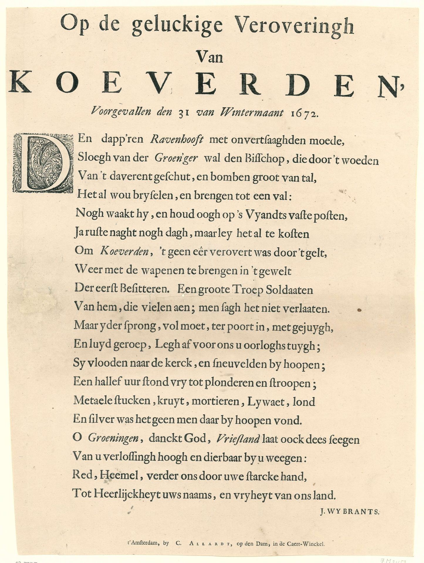
1672 - 1673
Vers op de verovering van Coevorden op 30 december 1672
J. Wijbrants
@jwijbrantsLocation
RijksmuseumListen to curator's interpretation
Curatorial notes
Editor: Here we have a print titled "Vers op de verovering van Coevorden op 30 december 1672," created between 1672 and 1673 by J. Wijbrants. It’s housed in the Rijksmuseum. My initial impression is that it resembles a proclamation, boasting of victory. What do you see in this piece? Curator: Indeed. It’s crucial to remember the political landscape of the Dutch Golden Age when viewing this. The artwork functioned as propaganda. It solidified a specific, positive narrative around the recapture of Coevorden. How do you think the average person would have received such a print? Editor: Probably with nationalistic pride. Were these types of prints common at the time? Did they help solidify support for the war? Curator: Precisely! The proliferation of such prints played a significant role in shaping public opinion. They functioned as accessible, reproducible forms of media, feeding a sense of shared identity and purpose during a period of intense conflict. Consider the intended audience beyond just the citizens celebrating this specific event: what message was sent to rival political powers? Editor: I see; it's a statement of power intended not only for internal consumption, but also a message directed outward. This really shifts my understanding of the piece! Curator: Exactly. Remembering the socio-political context helps reveal the complex function of these images within 17th-century Dutch society. Editor: So much more than just a historical document or piece of art! It served a strategic purpose in shaping the Dutch identity. Curator: Absolutely! And analyzing that function allows us to appreciate its multifaceted role in history.