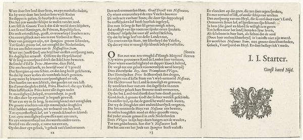
Nederlandstalig gedicht op de Nimfen van de Amstel, pagina 3 1640
0:00
0:00
crispijnvandeiipasse
Rijksmuseum
print, paper, typography
#
baroque
# print
#
paper
#
typography
Dimensions: height 140 mm, width 190 mm
Copyright: Rijks Museum: Open Domain
This is page three of a poem in Dutch, dedicated to the nymphs of the Amstel river, printed in the late 16th or early 17th century by Crispijn van de Passe the Younger. Printed with moveable type, each letter was individually cast from a matrix, and composed by hand. These were painstaking and highly skilled processes, representing the mechanization of writing during the rise of print capitalism. The evenness of the inking and the crispness of the lines speak to the expertise involved. However, the irregular kerning and variable density of the paper also draw our attention to the intimate, manual nature of the printing. The work’s physicality is a reminder that even ostensibly “immaterial” forms of communication always have a material basis. They rely on labor, resources, and expertise. Appreciating these things is key to understanding both the beauty, and the social context, of this artwork.
Comments
No comments
Be the first to comment and join the conversation on the ultimate creative platform.
More like this