drawing, print, paper, ink
#
drawing
# print
#
landscape
#
paper
#
ink
#
coloured pencil
Dimensions: height 160 mm, width 226 mm
Copyright: Rijks Museum: Open Domain
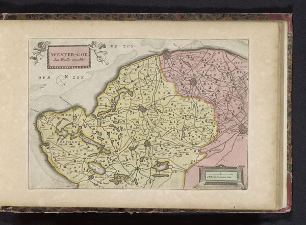
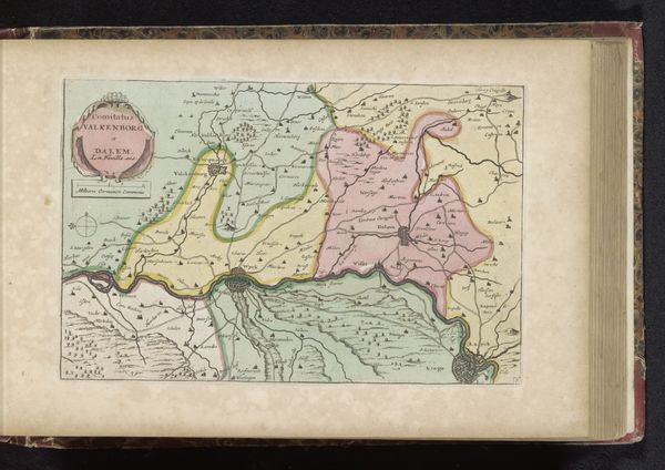
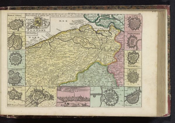
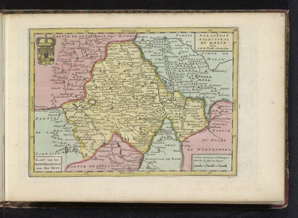
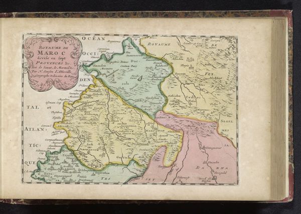
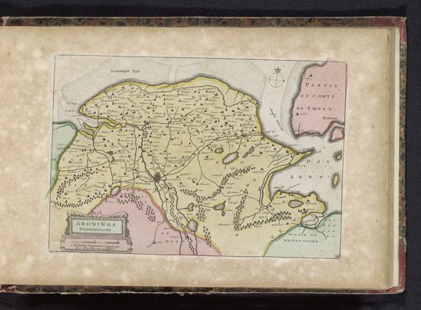
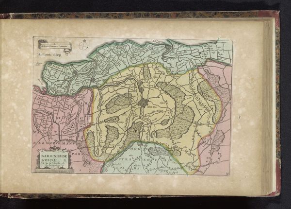
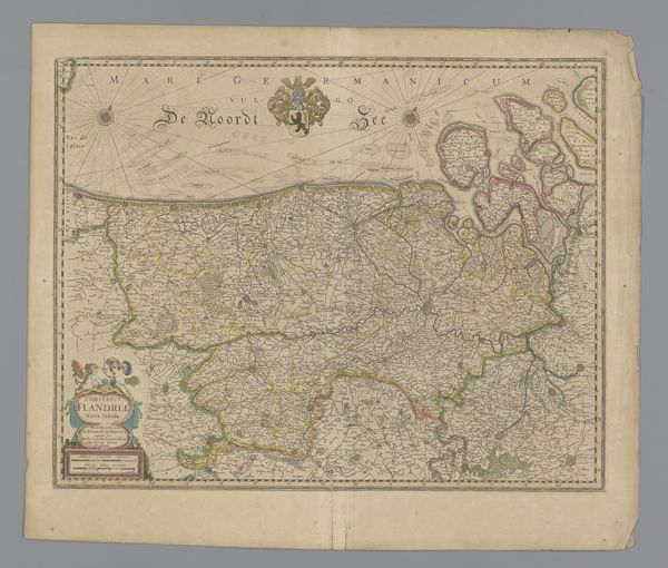
Editor: So, this is a map – “Kaart van Oostergo,” dating from sometime between 1700 and 1735, made by an anonymous artist. It's ink on paper, and right away, I’m drawn to the colors. They feel almost… whimsical? What catches your eye when you look at this? Curator: Whimsical, I like that! For me, it’s the blend of precision and artistry. Look how meticulously the landscape is rendered – the towns, the waterways – yet the colors add this dreamlike quality. It’s like looking at a memory of a place, rather than the place itself. Do you feel that tension too, between accuracy and interpretation? Editor: I think so, especially when I think about how maps today are generated by satellites and computer programs. It makes me wonder, what does this map tell us about how people in the 18th century saw their world? Curator: Ah, exactly! These old maps were never just about wayfinding. They are a statement about control, knowledge, and even beauty. The little embellishments, the flourishes around the title... it's like the artist is saying, "I’m not just showing you where things *are*, but how you should *feel* about them." Doesn't that almost make it a propaganda piece, in a strange, subtle way? Editor: That's a really interesting point, I hadn't thought of it that way before. It’s more than just geography. It’s… opinion! Curator: Exactly! And that, my dear friend, is where the real juice of art history lies: teasing out those layers of intention and cultural fingerprinting. Now I am seeing this piece through your eyes - thank you for the unexpected journey! Editor: And thank you for the perspective. Maps – not just for getting lost anymore!
Comments
No comments
Be the first to comment and join the conversation on the ultimate creative platform.
More like this