poster
#
pop art-esque
#
bold yellow colours
#
cartoon like
#
popart
#
cartoon based
#
pop art
#
retro 'vintage design
#
bright colours popping
#
pop art-influence
#
poster
#
reptilian
Copyright: Modern Artists: Artvee
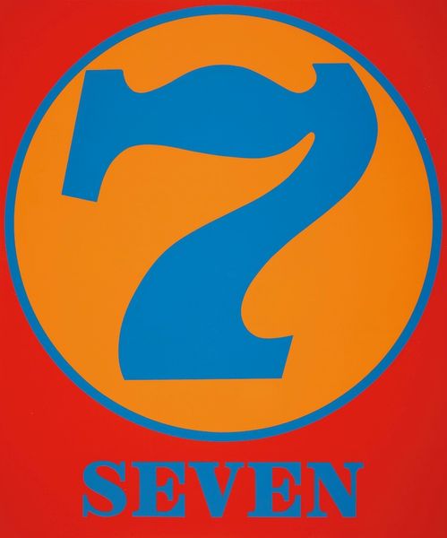
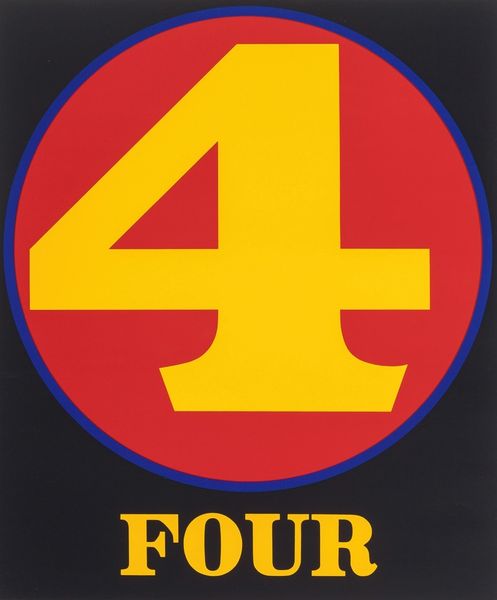
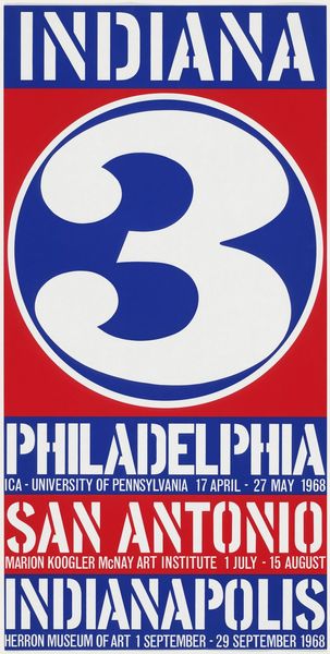
Robert Indiana made this screenprint, "Liberty '76," as part of the Kent Bicentennial Portfolio. It's pure pop, with those bold, flat colors and hard edges, like something you'd see on a vintage sign. The way the red '76 slams right into that star feels so immediate. The surface is smooth, almost slick, which makes the colors pop even more. Look at how the '7' and '6' overlap. It's like Indiana is playing with layering and transparency, even though it's all done with flat colors. The words surrounding the image give it a kind of graphic punch, reminiscent of advertising. It's all very clear and decisive. Indiana’s use of text and number as image brings Jasper Johns to mind, especially his paintings of numbers and letters, and like Johns, Indiana transforms the everyday into something iconic. This feels like a celebration, but also a critical reflection on what "liberty" really means. It's art that asks you to think and feel at the same time.
Comments
No comments
Be the first to comment and join the conversation on the ultimate creative platform.
More like this