graphic-art, mixed-media, print, typography, poster
#
graphic-art
#
mixed-media
# print
#
appropriation
#
figuration
#
typography
#
pop-art
#
poster
Copyright: Modern Artists: Artvee
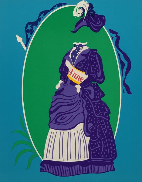
Robert Indiana made this advertisement for "The Mother of Us All, An American Pop Opera," using flat areas of colour to create a bold graphic image that really pops. It’s so graphic, like the printing press hitting the paper! The colours are so clean, it looks like screen printing. I'm drawn to the oval surrounding the figure, and how the American flag spills from the upper corners like a theatre curtain. The figure stands front and centre in a kind of uniform, emblazoned with the word “MOTHER.” It’s so strange, so flat, a figure that’s both a woman, and a monument. It really makes you think about the role of women, and how they are both celebrated and objectified in our culture. This bold use of colour and text feels very similar to the work of Corita Kent. It’s about distilling complex ideas into their simplest forms. There's ambiguity here, but that makes it richer.
Comments
No comments
Be the first to comment and join the conversation on the ultimate creative platform.
More like this