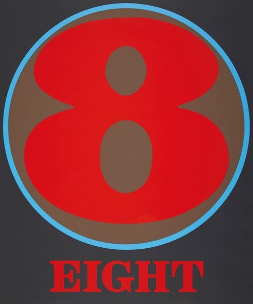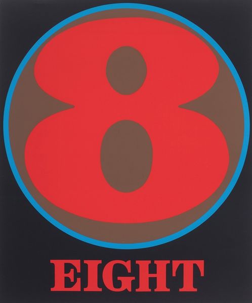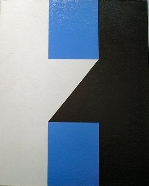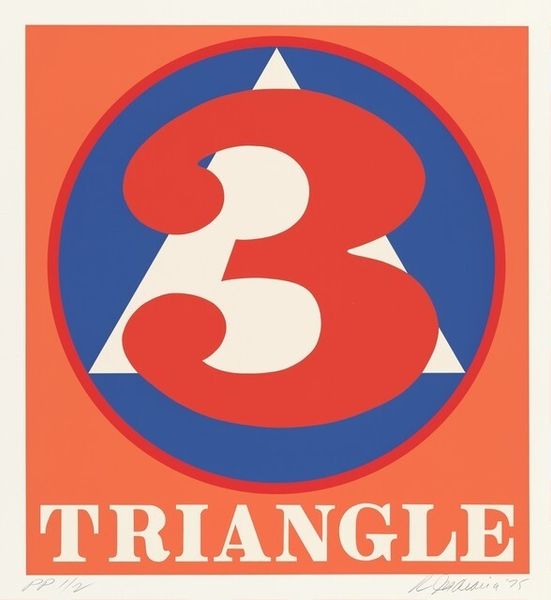
acrylic-paint, typography
#
pop art-esque
#
word art style
#
primary colour scheme
#
bold yellow colours
#
typography
#
pop art
#
colour-field-painting
#
acrylic-paint
#
typography
#
bright colours popping
#
eye-catchy type
#
geometric
#
cool colours
#
abstraction
#
pop-art
#
colourful imagery
Copyright: Modern Artists: Artvee
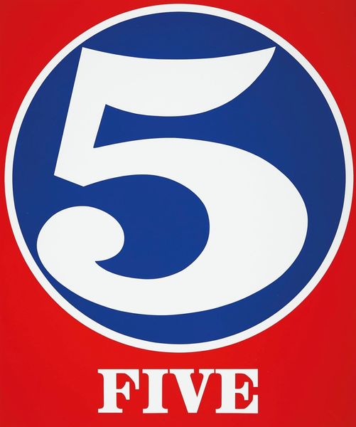
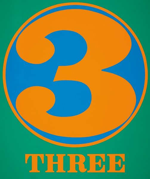
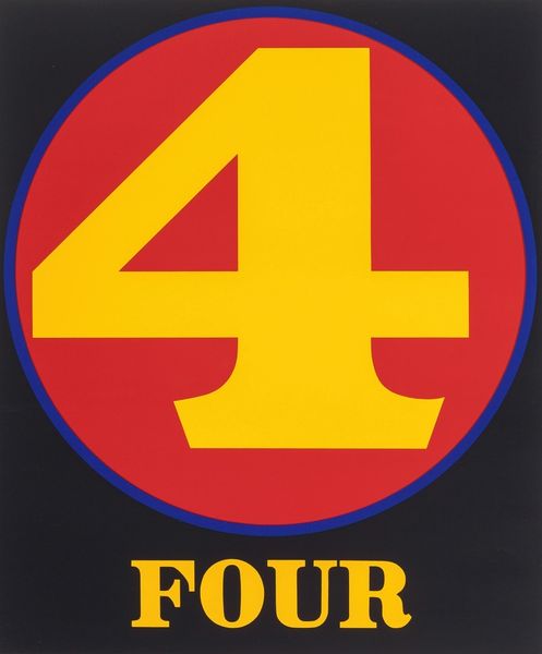
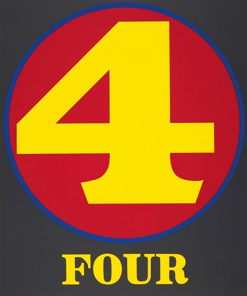
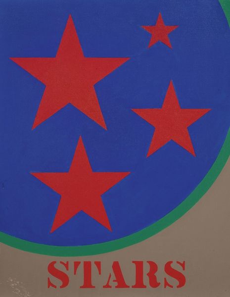
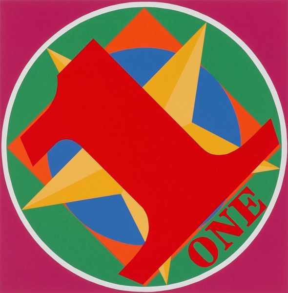
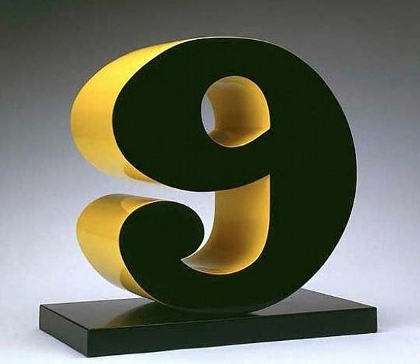
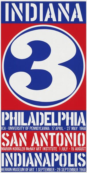
Robert Indiana made this "Numbers #7," with paint and, I suspect, stencils, because the edges are so crisp. You know, paint can be anything: thick, thin, drippy, or in this case, super flat. The flatness here, it's almost like a dare. Like Indiana is saying, "How much can I take away and still have it be interesting?" I love the hot, slightly clashing colors: the red ground, the orange circle, the cool blue number. It’s a simple formula that makes for a vivid image. The curve of the seven is so juicy, it reminds me of a Matisse cutout. The way he gets this kind of simple but bold geometry... it makes me think of early Stuart Davis, who also turned everyday signage into something fantastic. It's a reminder that art can be anywhere, even in the numbers we use every day.
Comments
No comments
Be the first to comment and join the conversation on the ultimate creative platform.
