drawing, print, engraving
#
drawing
# print
#
geometric
#
cityscape
#
engraving
Dimensions: height 170 mm, width 219 mm
Copyright: Rijks Museum: Open Domain
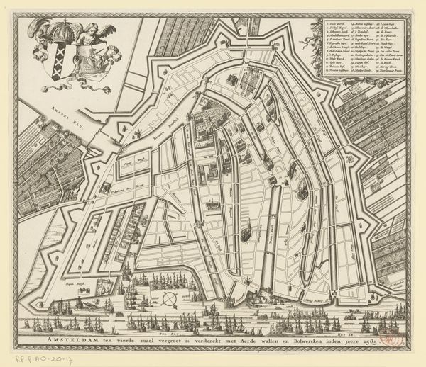
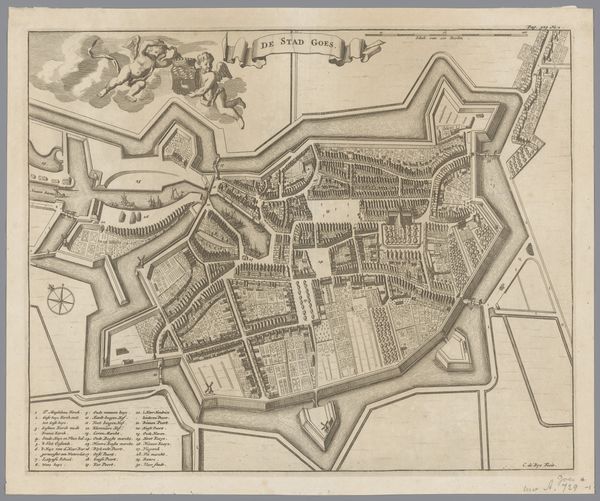
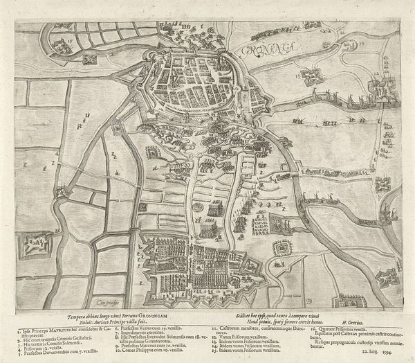
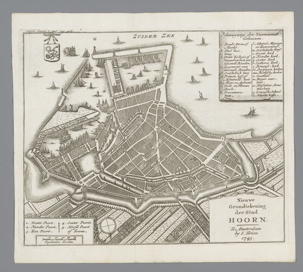
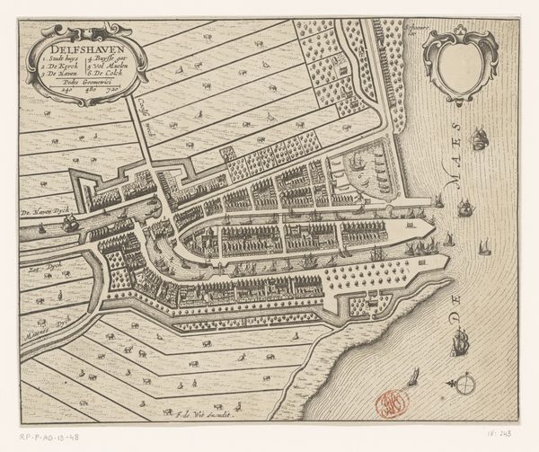
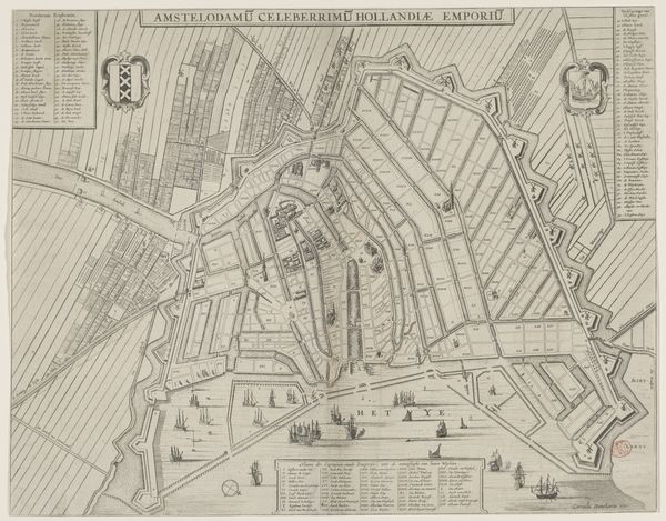
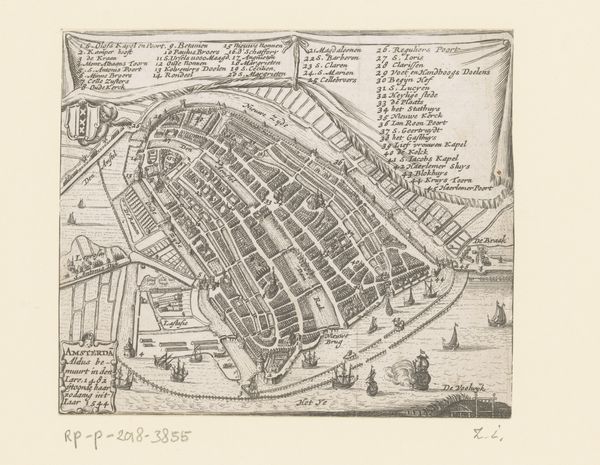
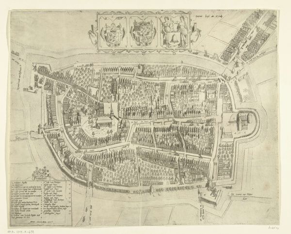
Editor: Here we have "Plattegrond van Amsterdam, 1585," a drawing and print rendered as an engraving dating back to the 17th century, housed here at the Rijksmuseum. Looking at this piece, the incredibly detailed line work really strikes me. How would you describe the most visually interesting elements of this map? Curator: Indeed. Focusing purely on the visual language, consider how the varying line weights create depth. The thicker lines define the fortifications and waterways, setting up a contrast against the thinner, more delicate lines delineating individual buildings and streets. Ask yourself how this variation structures the visual field, guiding the viewer's eye. Editor: So, it’s almost like the lines themselves are constructing a hierarchy of importance within the composition? Curator: Precisely. And beyond line, note the strategic use of hatching and cross-hatching to create tonal variations, mimicking shadow and depth. The stark contrast between the dense urban areas and the relatively empty spaces outside the city walls is very pronounced. Consider how this compositional strategy informs your perception of the represented space. Do you find it effective? Editor: Definitely. It highlights the enclosed nature of the city, like a separate, defined entity. Looking closely, the geometry also catches my eye. Is that typical for city maps of this era? Curator: Absolutely. Geometric forms dominate, lending a sense of order. Notice how the radial arrangement of the canals contributes to the visual dynamism of the piece. Yet, there’s a tension here, isn't there? The imposed geometry exists alongside a less rigid depiction of architectural forms. What does that tension convey, do you think? Editor: Maybe it reveals a certain...human element within a structured framework? It certainly gives a richer texture to something that could have been purely utilitarian. I hadn't thought about the visual language of maps before! Curator: Precisely! The map then becomes more than just a tool for navigation. It presents an intentional visual construct. I am so glad we have focused in this manner today.
Comments
No comments
Be the first to comment and join the conversation on the ultimate creative platform.
More like this