Dimensions: 35 x 23 cm
Copyright: David Michael Hinnebusch,Fair Use
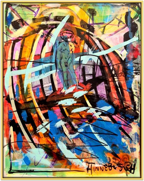
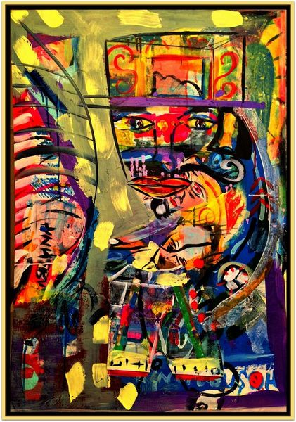
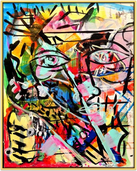
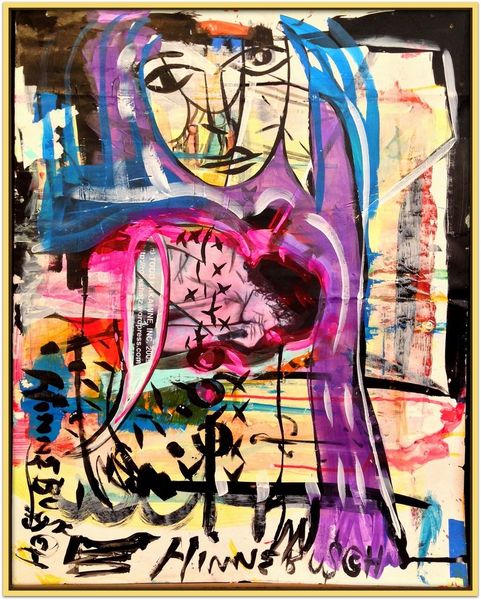
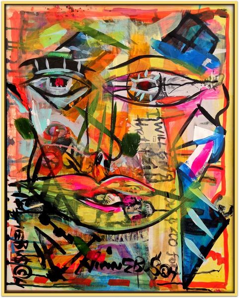
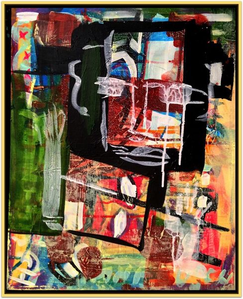
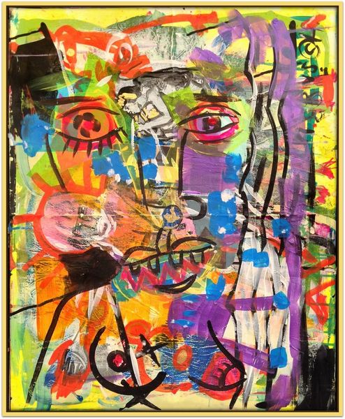
Editor: This is "Match," a mixed-media piece by David Michael Hinnebusch from 2017. There's such a bold energy here; it feels both chaotic and carefully composed. How do you interpret this work, looking at it from your perspective? Curator: Certainly. What strikes me is the interplay of line and color. The assertive black lines create a skeletal figuration, almost violently superimposed on a field of vibrant, restless color. Notice how the impasto technique enriches the tactile experience, making the color palette thrum with vitality. Consider, too, the ambiguous space; does it recede or advance? What tension does that ambiguity create? Editor: That push and pull between the figure and the ground, that is interesting. The black lines seem to trap the energy, but also define a form, of some kind. What do you make of the "naïve art" categorization given by one tag? Curator: That descriptor highlights the intentional disruption of conventional representation. The simplified lines, the flattening of form, align with a mode of seeing that rejects academic polish in favor of directness. However, look closer: this "directness" is incredibly sophisticated in its use of layering and contrast, undermining the idea of pure naivety. Note how this disruption aligns with the formal strategies of Abstract Expressionism but remains clearly figurative. Is the image meant to titillate? Editor: Hmmm… it is difficult for me to make that reading. The rawness in both subject matter and line might repel some. This conversation helped clarify what makes the artwork so jarring! Curator: Agreed, the tension is productive. Looking closely at the work of art reveals unexpected layers of complexity.
Comments
No comments
Be the first to comment and join the conversation on the ultimate creative platform.
More like this