About this artwork
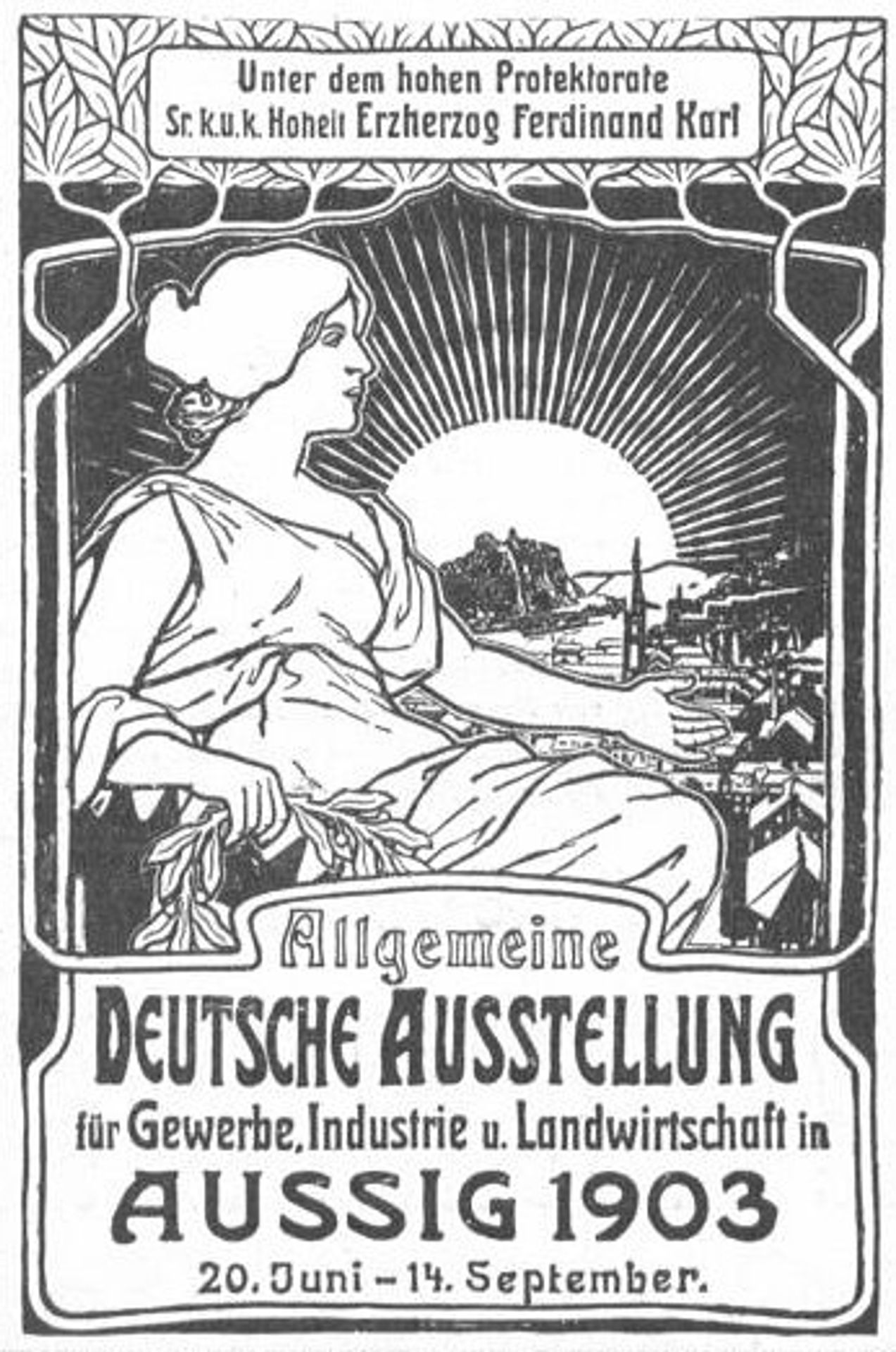
This is Alphonse Mucha’s black and white poster design for the German exhibition of 1903. Mucha really leaned into the graphic elements here, especially the contrast. The interplay of thick and thin lines is really striking. Look how he uses these strong outlines to define the figure and forms, but then fills them with these tight, intricate patterns, really pushing the surface. It’s almost like he’s building up the image layer by layer, carving into it. See how that graphic sun bursts out behind the city skyline? It’s so stylised. Mucha reminds me a little of someone like Aubrey Beardsley, in the way he plays with flatness and decoration. Both artists use pattern to flatten out space. I love art that keeps you guessing, that doesn’t give you all the answers. I’m still figuring this one out myself.
General German poster exhibition for trade, industry and agriculture
1903
Artwork details
- Medium
- lithograph, print, poster
- Copyright
- Public domain
Tags
Comments
Share your thoughts
About this artwork
This is Alphonse Mucha’s black and white poster design for the German exhibition of 1903. Mucha really leaned into the graphic elements here, especially the contrast. The interplay of thick and thin lines is really striking. Look how he uses these strong outlines to define the figure and forms, but then fills them with these tight, intricate patterns, really pushing the surface. It’s almost like he’s building up the image layer by layer, carving into it. See how that graphic sun bursts out behind the city skyline? It’s so stylised. Mucha reminds me a little of someone like Aubrey Beardsley, in the way he plays with flatness and decoration. Both artists use pattern to flatten out space. I love art that keeps you guessing, that doesn’t give you all the answers. I’m still figuring this one out myself.
Comments
Share your thoughts