About this artwork
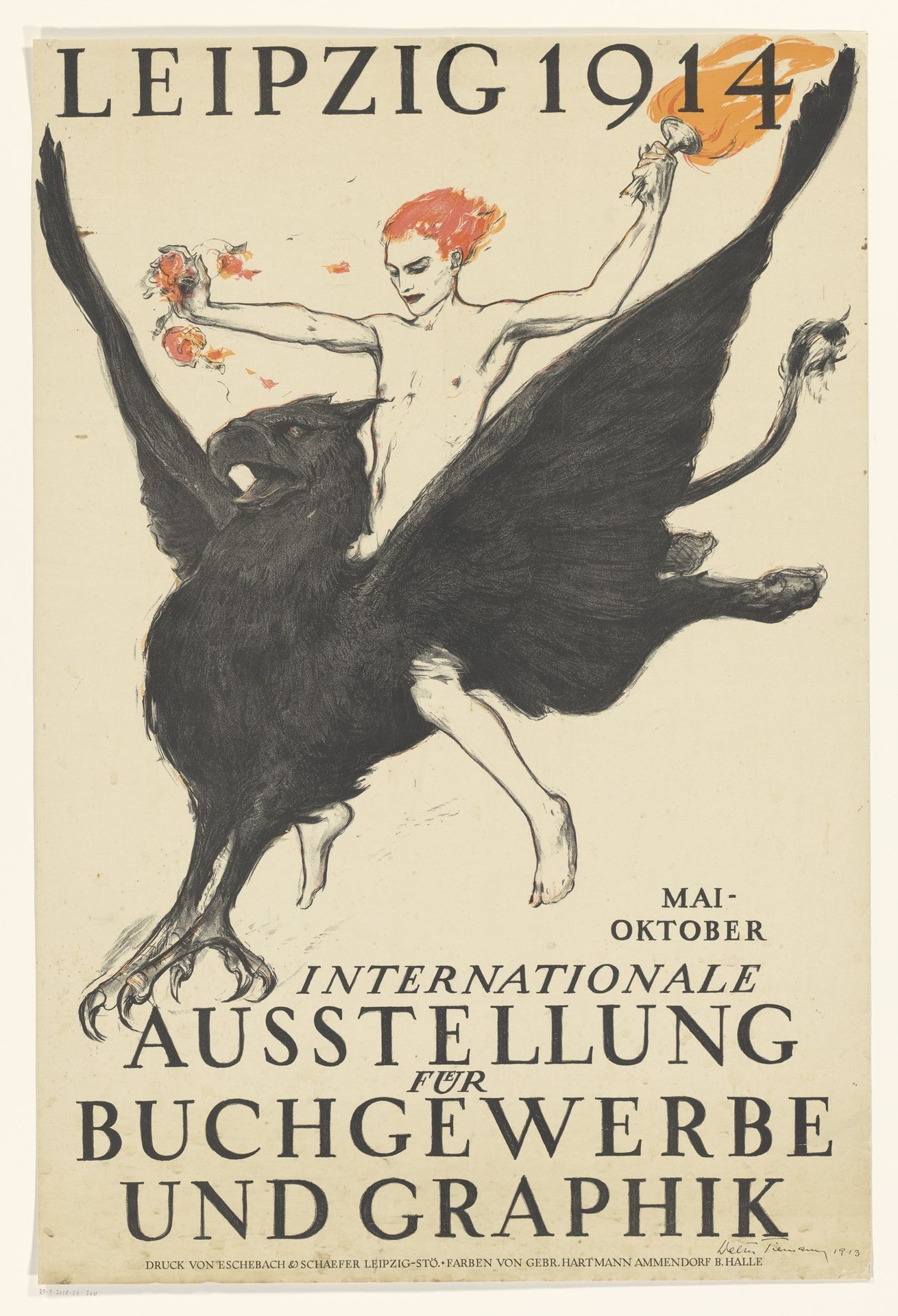
Editor: So, this poster, "Affiche voor de Internationale Tentoonstelling voor Boeknijverheid en Grafiek" by Walter Tiemann, was created in 1913. It's a print advertising an international exhibition on bookmaking and graphics. What strikes me is the contrast – a mythological creature alongside very modern typography. What do you make of that juxtaposition? Curator: For me, the crucial aspect lies in the industrial processes. This isn't just about aesthetics; it’s about the mechanics of production. Look at the printing itself - lithography, likely. How does the method influence the final product, its accessibility, its function as advertising? How did mass production methods shape visual culture? Editor: So, you're seeing it as a commentary on the means of production itself? How does the artist grapple with new industrial processes of the time? Curator: Precisely. And it’s worth investigating what it meant to display book-making and graphic design as “industry”. How did people begin to define, categorize and, subsequently, value different types of labour in the early 20th century? Were these objects ‘art’ or something else entirely? How might these questions change depending on who you ask? Editor: That's interesting. I hadn't considered how the "industry" label impacts our understanding. The poster transforms the art into product and labor. Thanks for sharing such different points of view on this fascinating print. Curator: Indeed! The material conditions of art's creation deeply impact its meaning. Thanks for your insightful questions.
Affiche voor de Internationale Tentoonstelling voor Boeknijverheid en Grafiek
1913
Artwork details
- Medium
- drawing, graphic-art, print, poster
- Dimensions
- height 890 mm, width 595 mm
- Copyright
- Rijks Museum: Open Domain
Tags
Comments
Share your thoughts
About this artwork
Editor: So, this poster, "Affiche voor de Internationale Tentoonstelling voor Boeknijverheid en Grafiek" by Walter Tiemann, was created in 1913. It's a print advertising an international exhibition on bookmaking and graphics. What strikes me is the contrast – a mythological creature alongside very modern typography. What do you make of that juxtaposition? Curator: For me, the crucial aspect lies in the industrial processes. This isn't just about aesthetics; it’s about the mechanics of production. Look at the printing itself - lithography, likely. How does the method influence the final product, its accessibility, its function as advertising? How did mass production methods shape visual culture? Editor: So, you're seeing it as a commentary on the means of production itself? How does the artist grapple with new industrial processes of the time? Curator: Precisely. And it’s worth investigating what it meant to display book-making and graphic design as “industry”. How did people begin to define, categorize and, subsequently, value different types of labour in the early 20th century? Were these objects ‘art’ or something else entirely? How might these questions change depending on who you ask? Editor: That's interesting. I hadn't considered how the "industry" label impacts our understanding. The poster transforms the art into product and labor. Thanks for sharing such different points of view on this fascinating print. Curator: Indeed! The material conditions of art's creation deeply impact its meaning. Thanks for your insightful questions.
Comments
Share your thoughts