drawing, graphic-art, print, paper, typography, poster
#
art-deco
#
drawing
#
graphic-art
#
historical design
# print
#
paper
#
typography
#
poster
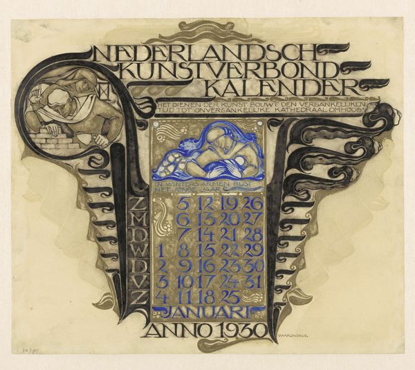
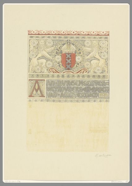
Dimensions: height 379 mm, width 448 mm, height 225 mm, width 130 mm
Copyright: Rijks Museum: Open Domain
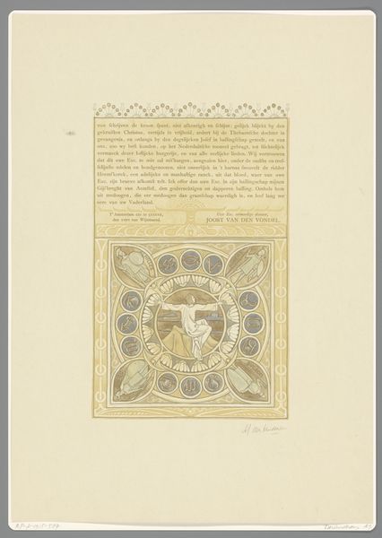
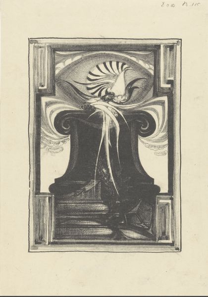
Willem Arondéus made this calendar for the Nederlandsch Kunstverbond, or Dutch Art Association, in 1930. There's a sort of careful frenzy in how he’s using line and color here, so orderly, yet exuberant! The whole piece feels both solid and ephemeral, don’t you think? Look at the textures he’s created. The lettering feels weighty, carved out, permanent, and that strange cloud of looping shapes is very free flowing. The contrast between the gold and blues feels very rich. I love the way the sleeping figures are rendered; they are so serene and solid. Arondéus work feels like a precursor to some of Paul Klee’s graphic explorations. Both have a unique way of blending text and image with a sense of play. What's so great about art is that it's always open to new interpretations, just like a good calendar, always ready for a new day.
Comments
No comments
Be the first to comment and join the conversation on the ultimate creative platform.
More like this