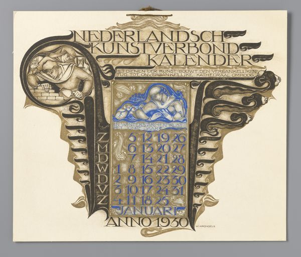
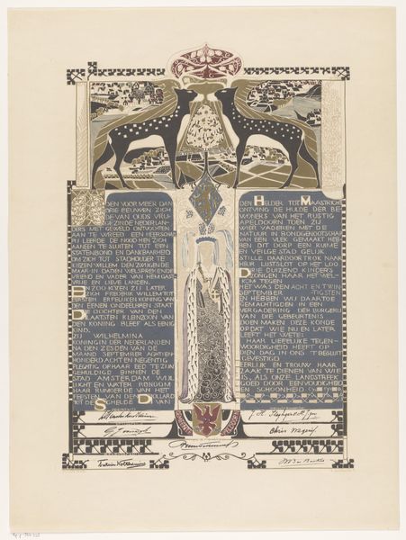
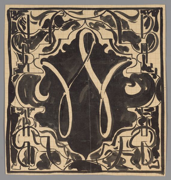
Ontwerp voor een kalenderblad voor januari 1930 van de Nederlandsch Kunstverbond Kalender 1929
0:00
0:00
willemarondeus
Rijksmuseum
Dimensions: height 370 mm, width 432 mm
Copyright: Rijks Museum: Open Domain
Willem Arondéus designed this calendar page for January 1930 with ink and gouache. Look at the way he uses the materials, how the ink is built up in layers. It's like he's thinking through the process, letting the materials guide him. The heavy, dark inks give real weight to the figures of labor and rest, while the translucent gouache imbues the design with a mystical quality. Notice especially the contrast between the blocky forms of the bricklayer on the left and the floating blues of the figure in the upper center. It’s like Arondéus is contrasting labor and rest, maybe even life and death, and setting it to a schedule! The whole thing reminds me of the work of Aubrey Beardsley, who also embraced graphic design as an art form. In the end, art is an ongoing conversation, full of questions and possibilities.
Comments
No comments
Be the first to comment and join the conversation on the ultimate creative platform.
More like this