Kalligrafie: lettertypen uit de derde eeuw voor Christus tot en met de dertiende eeuw c. 1890 - 1922
0:00
0:00
drawing, graphic-art, paper, typography, ink
#
portrait
#
drawing
#
graphic-art
#
medieval
#
hand-lettering
#
typeface
#
hand drawn type
#
hand lettering
#
paper
#
typography
#
ink
#
hand-drawn typeface
#
fading type
#
geometric
#
stylized text
#
thick font
#
handwritten font
#
decorative-art
#
calligraphy
#
small lettering
Copyright: Rijks Museum: Open Domain
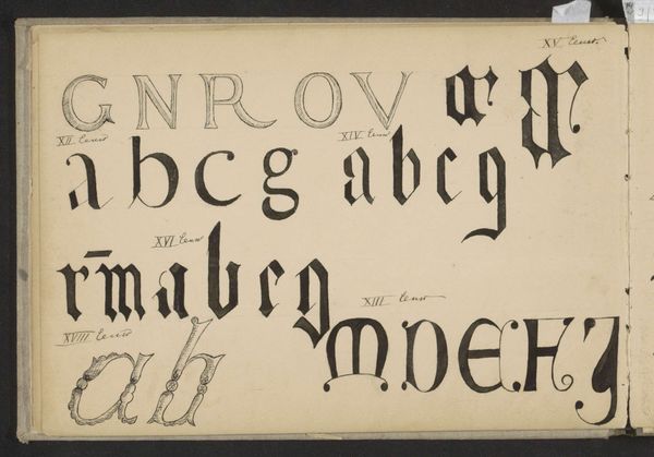
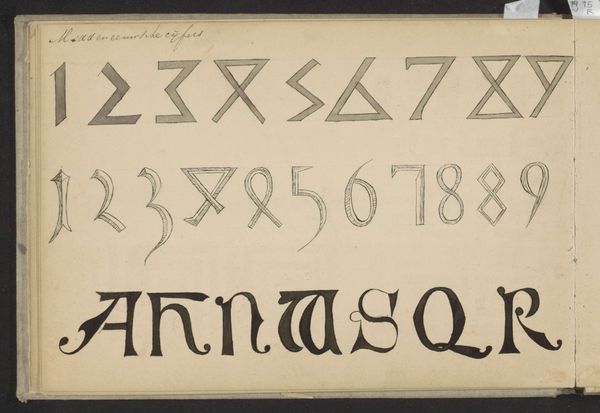
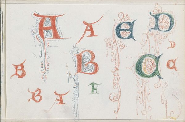
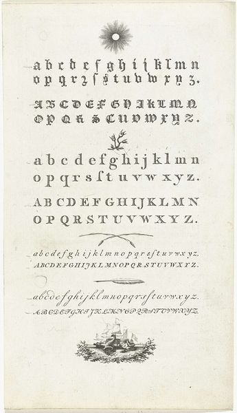
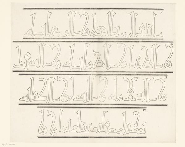
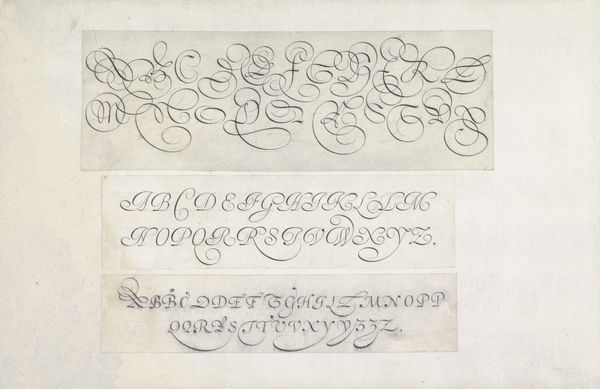
Johanna van de Kamer made this calligraphic study, a sheet showing different letter types, evoking forms from the third century BC to the thirteenth century. The process of drawing, or perhaps even painting these letters feels akin to the work of Sol Lewitt, a conceptual process enacted through the hand. Look at the way the strokes vary in thickness, some solid and heavy, others just outlines, some filled with a light wash. Each letter is a small architecture. Consider the ‘A’ in the third row, how the serifs flare out like wings, adding an ornamental touch, a trace of the gothic. The way the marks are made gives each letter a distinct personality, a particular mood or attitude. This piece reminds me of the Pattern and Decoration movement of the 1970s, which similarly looked to historical and decorative forms as a source of artistic inspiration. It points to the long conversation between artists across time, each finding inspiration in the forms and ideas of the past.
Comments
No comments
Be the first to comment and join the conversation on the ultimate creative platform.
More like this