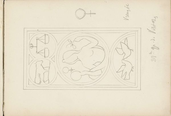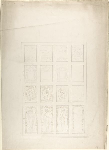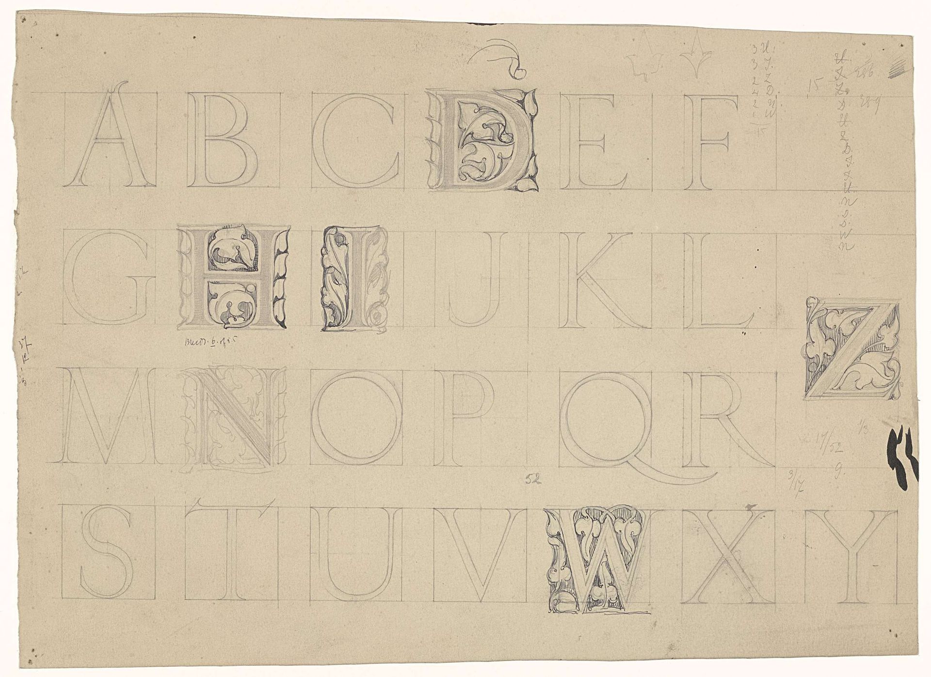
1869 - 1925
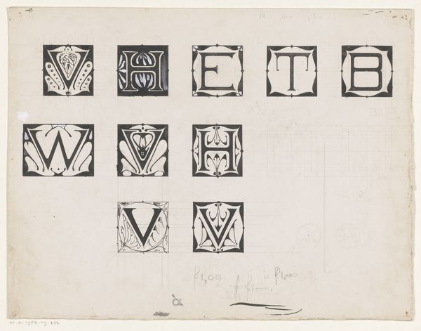
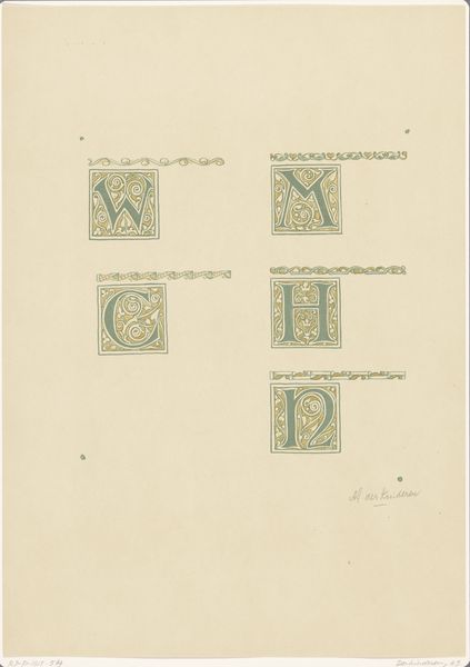
De letters van het alfabet, waarvan enige versierd zijn met ranken
Listen to curator's interpretation
Curatorial notes
Editor: Here we have "De letters van het alfabet, waarvan enige versierd zijn met ranken," or "The letters of the alphabet, some of which are decorated with tendrils" by Antoon Derkinderen, created between 1869 and 1925, rendered in pencil on paper. It has the look of a study, with letters carefully sketched out, some adorned with delicate foliage. It makes me wonder if it's a page from a sketchbook used to design a typeface. What can you tell us about it? Curator: This work speaks volumes about the artistic climate of the late 19th and early 20th centuries. The Arts and Crafts movement was in full swing, advocating for a return to handcrafted artistry in response to industrialization. This alphabet study reflects that ethos. Editor: How so? Curator: Consider the time period. There was increasing alienation and exploitation caused by industrial labor models. Artists saw beauty in craftsmanship. The attention to detail and the inclusion of organic, hand-drawn embellishments… These elements elevate what could have been a simple exercise in typography to a celebration of artisanal skill. Derkinderen's focus on integrating nature within these constructed forms ties it to a larger socio-political stance. The politics of the image here celebrate an anti-establishment worldview through design. Do you see the connection? Editor: Yes, I think so. The careful hand lettering is in itself a statement about valuing the handmade. The delicate details bring to mind illuminated manuscripts, harking back to pre-industrial modes of creation. Curator: Exactly! It highlights a nostalgia and cultural commentary. These public displays celebrated craft skills as political stances against mechanized reproduction. Editor: It's fascinating to consider this as more than just a simple sketchbook page. I never thought of typography as something that could carry social and political meaning. Curator: Art often exists within a wider cultural framework, and this piece invites us to consider the social role and intention behind its creation.