graphic-art, print, textile, typography, engraving
graphic-art
baroque
textile
typography
engraving
Dimensions: height 455 mm, width 390 mm
Copyright: Rijks Museum: Open Domain
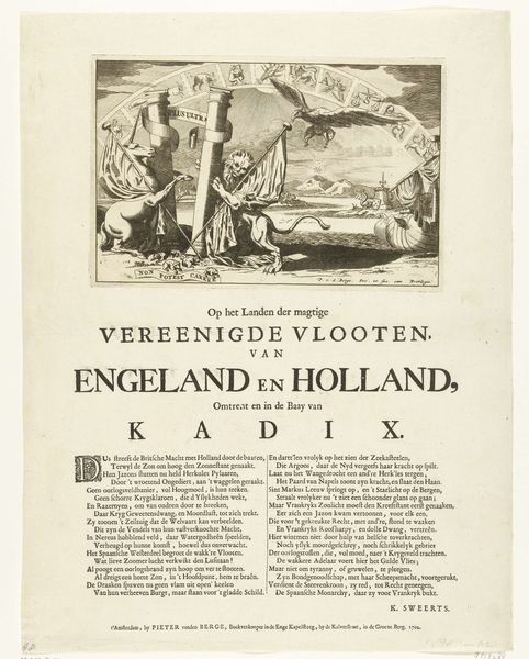
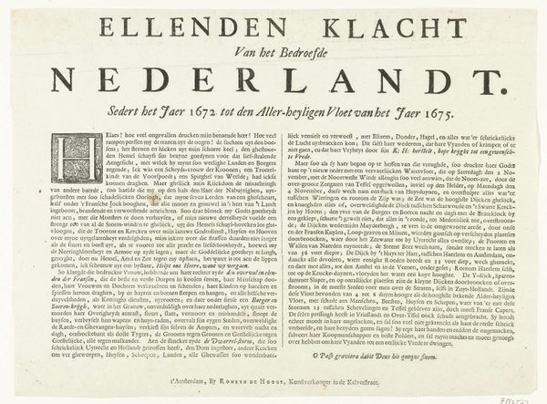
Editor: Okay, here's something striking. It’s a broadside print titled "Vers op de uitvaart van Michiel de Ruyter," or "Verse on the Funeral of Michiel de Ruyter," made in 1677 by David Lingelbach. It combines text, typography, and engraving. It feels very formal and almost overwhelming with all the text, and I confess, I don't know where to even begin. What do you see in this piece, as a cultural object? Curator: Well, you're right, it's packed! What's crucial here is understanding its function. Broadsides like this were essentially early forms of mass media. This wasn't just about mourning Michiel de Ruyter; it was about shaping his legacy, solidifying his image as a national hero. Think of it as carefully constructed public relations in the wake of a major historical event, leveraging public sentiment and patriotism. How does knowing it's *public* art influence your reading of the text and image? Editor: That's fascinating! So, the elaborate language and titles aren't just about respect, they're about crafting a specific image for the public? It makes the formality feel less like tradition and more like calculated promotion of a hero. I suppose this piece then makes a pretty significant political statement, no? Curator: Precisely. Consider the political climate of the Dutch Republic at the time. They needed heroes, unifying figures, especially after a loss like this. How does the inclusion of the printer's information – "To Amsterdam, by Willem Saumont" – play into that? What's the effect of tying the broadside to a known local business? Editor: It gives it authority and makes it seem official, almost like a government publication. Also, the Baroque style - all the flourish and grandeur, elevates de Ruyter, cementing his importance through visual language. Knowing that really shifts how I view this, it’s less a lament and more of a public memorial! Curator: Exactly. We often separate art from politics, but works like this demonstrate how deeply intertwined they are. This wasn't just a memorial; it was a carefully orchestrated piece of political theater. Editor: I'll definitely look at other broadsides with this in mind. I never realized how much they reveal about the cultural values that shaped art creation. Curator: Indeed! By examining these historical prints, we can study cultural memory as an actively produced thing.
Comments
No comments
Be the first to comment and join the conversation on the ultimate creative platform.
More like this