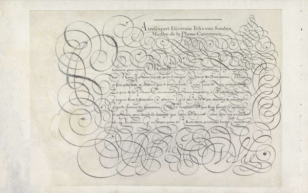
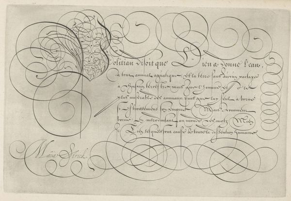
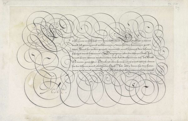
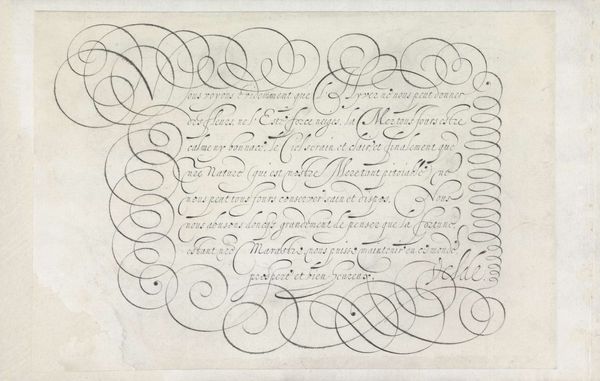
Schrijfvoorbeeld met de tekst: Romanus benoordeelt zynde dat hy niet (...) 1618
0:00
0:00
lievenwillemszcoppenol
Rijksmuseum
drawing, textile, ink
#
drawing
#
hand-lettering
#
baroque
#
dutch-golden-age
#
old engraving style
#
hand drawn type
#
hand lettering
#
textile
#
word art
#
ink
#
hand-drawn typeface
#
stylized text
#
calligraphic
#
golden font
#
decorative-art
#
calligraphy
#
small lettering
Dimensions: height 192 mm, width 278 mm
Copyright: Rijks Museum: Open Domain
Curator: Looking at this sheet, I'm struck by how kinetic it feels. It's called "Schrijfvoorbeeld met de tekst: Romanus benoordeelt zynde dat hy niet (...)" which roughly translates to "Writing sample with the text: Romanus condemns being that he doesn't (...)", created around 1618 by Lieven Willemsz. Coppenol. It's held in the Rijksmuseum collection and executed in ink. The swirling lines give the impression of a script tornado! Editor: A tornado of scripture indeed! The eye dances across the page, tracing the elegant chaos. What do you make of the symbols at play here, the cultural echo chamber within this seemingly straightforward writing sample? Curator: I think that the elaborate flourishes surrounding the text elevate it beyond a simple exercise. These weren't just letters; they were imbued with a sense of status, artistry, and deliberate ambiguity. I notice a blend of precision and whimsy. See how Coppenol seems to revel in extending and looping certain strokes almost arbitrarily, while still adhering to some formal structure? Editor: Precisely! It's as though Coppenol is teasing us. We read the main text—which already alludes to themes of judgement with this character 'Romanus'—but the interwoven lines become visual barriers, demanding a closer look, a decryption. Curator: Maybe it's also a game. The beautiful penmanship seduces you, but good luck trying to read all of that very old Dutch! Still, I find a sort of personal energy coming out of all that looping script; what it lacks in immediate legibility, it makes up for with this sort of visual melody. It’s Baroque dynamism distilled onto a single page. Editor: The density and theatricality you describe certainly channel that Baroque spirit! Perhaps those interwoven lines are designed to test one's perception – encouraging focused meditation by way of disorientation. There’s the pronouncement, yes, but more so, there’s the aesthetic act. It feels as though Coppenol understood the power and symbolism held in lettering itself. Curator: Right. So, while it's just a "writing sample", its beauty speaks to the symbolic value the culture ascribed to calligraphy and the written word, more generally. It is an old script looking like a coded message in a bottle from 400 years ago, carrying complex visual and cultural information! Editor: Indeed. A reminder that images communicate across time through patterns and shapes.
Comments
No comments
Be the first to comment and join the conversation on the ultimate creative platform.
More like this