print, typography, engraving
#
script typeface
#
hand-lettering
# print
#
old engraving style
#
hand drawn type
#
hand lettering
#
old fashioned
#
typography
#
hand-drawn typeface
#
thick font
#
handwritten font
#
golden font
#
engraving
Dimensions: height 195 mm, width 250 mm
Copyright: Rijks Museum: Open Domain
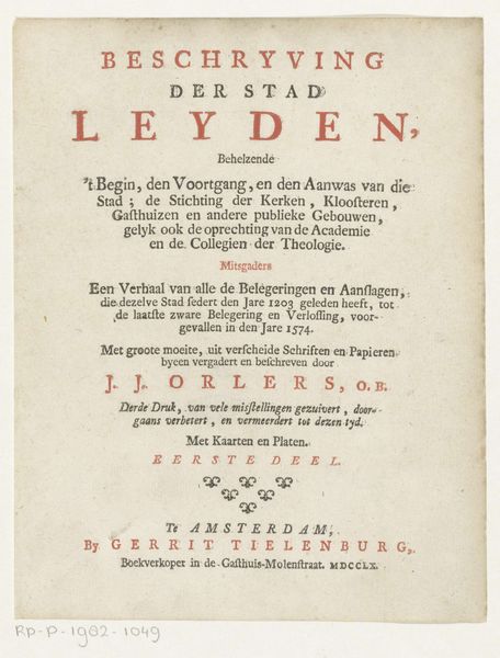
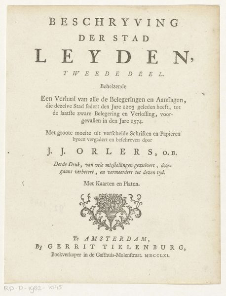
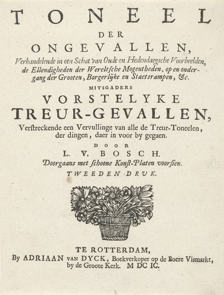
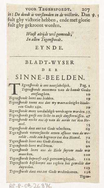
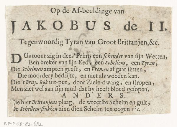
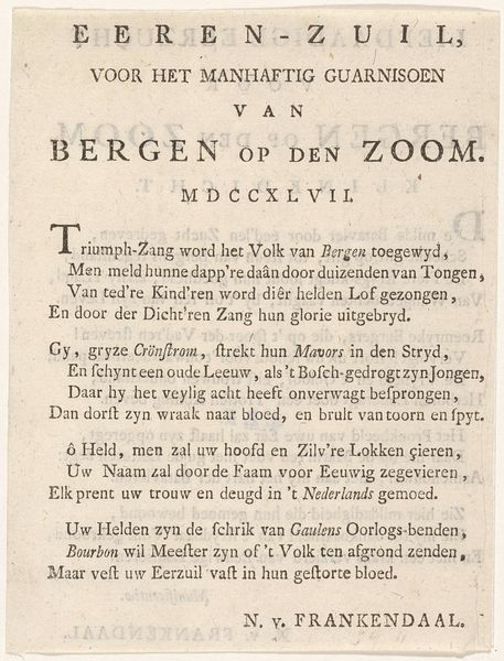
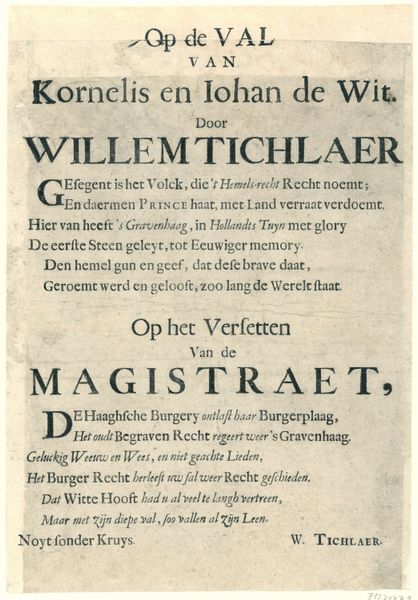
Editor: So, this is an invitation to the funeral of the poet Jan van Gijsen, printed in 1722. What strikes me first is the lettering – it's so ornate, but also quite stark against the pale paper. It’s almost… joyful, despite the somber occasion. What do you see in this piece? Curator: Joyful, yes, I think that's perceptive! To me, these printed notices always whisper stories. It's a slice of 18th-century Amsterdam. The lettering, you're right, isn't mournful, is it? Perhaps celebrating his life as a poet, "die nimmer schreef als op Maat"—who never wrote without measure, as the text says! It directs attendees right down to Belleflam, the Haarfynder, who knew him in life and death. Did they want just the right tone? Perhaps the printing itself suggests how the elite would behave? It invites more thought than tears! Editor: A printed invitation! Did everyone get one, or just certain people? Curator: Good question! Most likely, it would be limited to Van Gijsen's social circle: other poets, intellectuals, patrons. Think of it as an early form of targeted advertising, not for profit, but for remembrance. But this also begs the question, were YOU invited? Editor: Haha, if only I could travel through time! It’s fascinating to think of who might have received this and how they would have reacted. Thanks, that makes me appreciate the craftsmanship involved and also the historical context. Curator: Exactly! It's not just ink on paper; it's a portal to a different world, filled with poets, Haarfynders, and surprisingly celebratory funerals. And, in its own way, quite beautiful, don't you think?
Comments
No comments
Be the first to comment and join the conversation on the ultimate creative platform.
