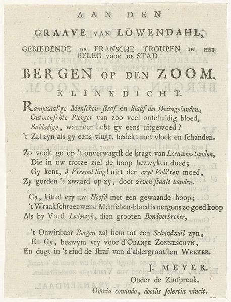
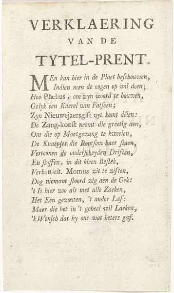
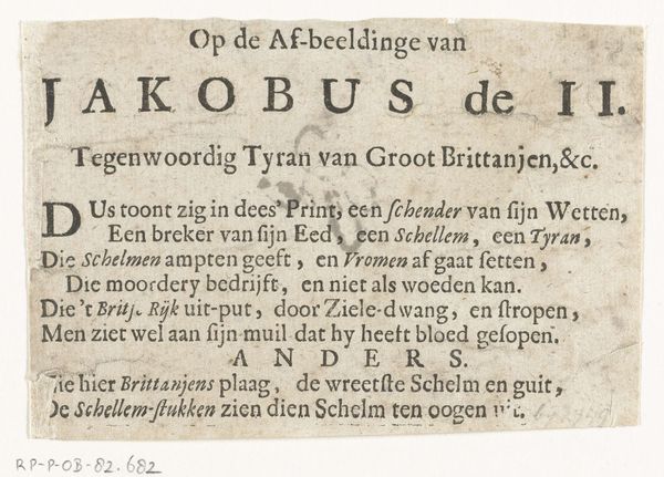
Vers op de verdediging van Bergen op Zoom tegen de Fransen, 1747 1747
0:00
0:00
nicolaasvanfrankendaal
Rijksmuseum
print, typography, engraving
#
script typeface
#
written text
#
hand-lettering
# print
#
hand drawn type
#
paragraph style
#
typography
#
stylized text
#
thick font
#
handwritten font
#
engraving
#
historical font
#
columned text
Dimensions: height 147 mm, width 112 mm
Copyright: Rijks Museum: Open Domain
Nicolaas van Frankendaal created this print in 1747 to honor the defense of Bergen op Zoom against the French. It’s an engraving, meaning the artist would have used a tool called a burin to carve lines into a metal plate, likely copper. Ink is then applied to the plate, wiped off the surface, and then paper is pressed against the plate to pick up the ink from the recessed lines. The texture of the paper is smooth, but if you look closely, you can see the crisp, precise lines that define the lettering and the overall design. This process allowed for the relatively quick production of multiple copies, which was crucial for disseminating information and, in this case, celebrating a military victory. The act of creating and distributing prints like this one was tied to broader social issues. It was a way to shape public opinion and foster a sense of national pride. It speaks to the labor and skill involved in both the artistic creation and the industrial production of such images. This print exemplifies how materials, making, and context intertwine to give an artwork its full meaning, blurring the lines between fine art and craft.
Comments
No comments
Be the first to comment and join the conversation on the ultimate creative platform.
More like this