print, typography, engraving
#
hand-lettering
#
baroque
#
dutch-golden-age
# print
#
old engraving style
#
hand lettering
#
typography
#
stylized text
#
thick font
#
engraving
#
historical font
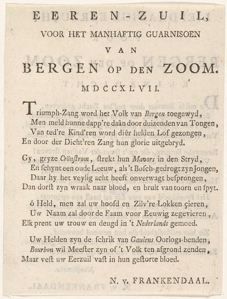
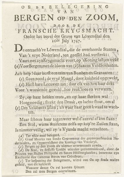
Dimensions: height 153 mm, width 115 mm
Copyright: Rijks Museum: Open Domain
Curator: This engraving from 1747 by Jan Meijer is entitled "Vers op het beleg van Bergen op Zoom, 1747," which translates to "Verse on the siege of Bergen op Zoom, 1747". What is your immediate take on this artwork? Editor: It strikes me as remarkably direct, almost brutal, in its presentation. The text itself becomes the artwork; there's a stark, confrontational quality to its very presence. Curator: Precisely. Its formal construction is critical to understanding its force. Notice how Meijer employs typography as a weapon. The bold, thick font of "BERGEN OP DEN ZOOM" emphasizes its power and its resistance against invaders. Editor: It’s also clear that the artist is employing this print as propaganda; he clearly wishes to elicit patriotic feelings with carefully chosen phrases and targeted statements aimed at authority figures and freedom fighters. The layered language is certainly evocative. Curator: Indeed. Meijer's choice to use an engraving reinforces this effect. The medium itself is tied to dissemination and the public sphere. The stark contrast and precise lines further accentuate the themes of siege and resistance that dominate the text. The engraving becomes a vessel for conveying the urgency of this historic event, in typography that evokes its context. Editor: I am most intrigued by the dedication "Aan den Grave van Löwendahl" and the fierce verses directed at a foreign entity oppressing freedom fighters: he attempts to sway public opinion through the printed image and references heroic leaders for his cause. Also, observe his sign-off, a flourish of confidence: "Omnia conando, docilis solertia vincit" implying the conflict is won with effort and ingenuity. Curator: It is a powerful rhetorical ending, which also demonstrates the capacity of artistic mediums to evoke feeling through visual texture. In terms of artistic effect, the bold inscription certainly contributes to its lasting image as an artwork. Editor: It's remarkable how much historical context can be unlocked through what at first glance appears to be a simple typographic piece. I have gained a newfound respect for the socio-political dimensions underpinning the piece.
Comments
No comments
Be the first to comment and join the conversation on the ultimate creative platform.
More like this