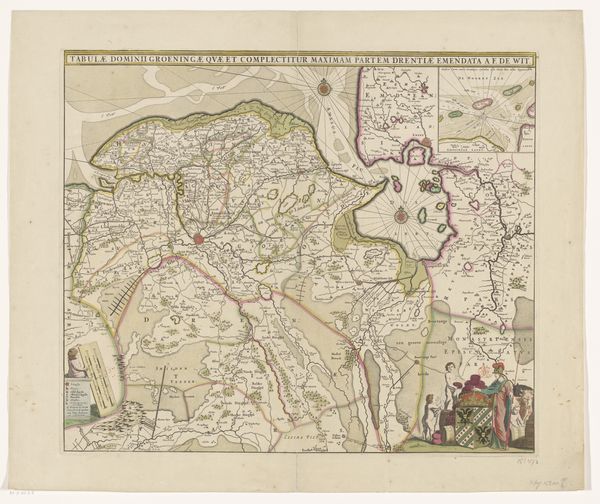
graphic-art, print, etching, engraving
graphic-art
neoclacissism
etching
etching
history-painting
engraving
Dimensions: height 438 mm, width 530 mm
Copyright: Rijks Museum: Open Domain
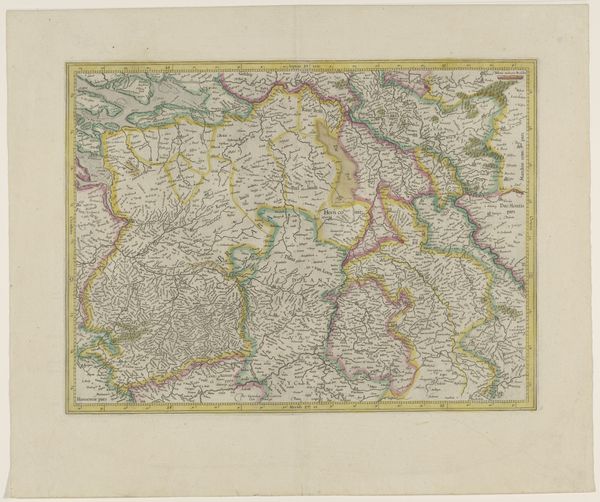
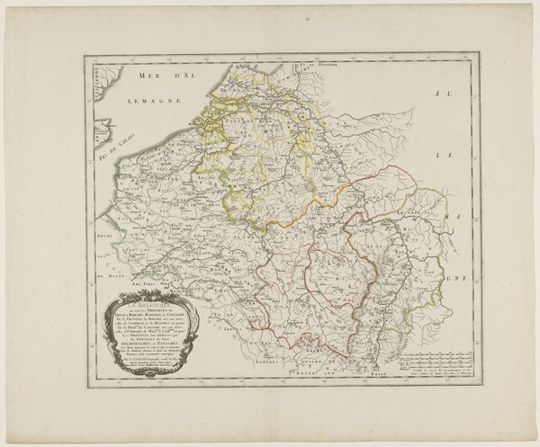
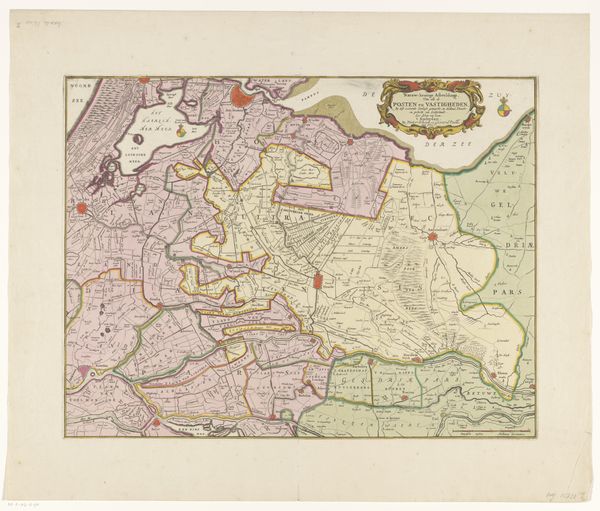
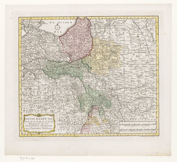
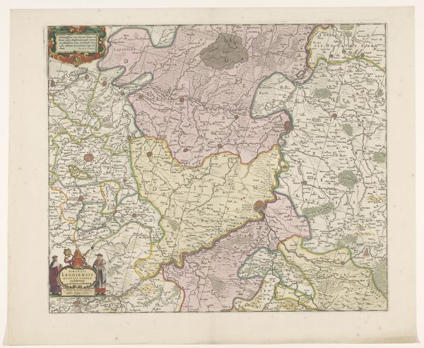
Curator: Alright, let's dive into this fascinating map. It's called "Kaart van de Zuidelijke Nederlanden," or "Map of the Southern Netherlands," made around 1780. John Lodge was the artist behind it, rendered with etching and engraving techniques. Editor: Oh, my! At first glance, it's a gentle dance of pale greens and yellows. It feels…pastoral, like a whispered secret from history, even with all the boundaries. I’m immediately struck by how it manages to make political division feel so quaint. Curator: Exactly! The colors are deceptive. Neoclassicism was having its day, and this is a very orderly representation, which reflects an attempt to apply reason and structure even to something as messy as geographical boundaries and political control. Editor: Right, the age of "enlightenment" imposing itself on the land, even. I’m curious about the little embellishments at the bottom – the flowery cartouche framing “The Catholic Netherlands”. The map transforms into more than just a record. It whispers of faith, identity…resistance? Curator: Oh, absolutely! Maps of this era weren't just about navigation; they were powerful tools for claiming territory and defining identity. The symbolic weight is clear; Lodge emphasizes "Catholic Netherlands," in an era of immense political and religious upheaval. The etched lines almost vibrate with that tension. Editor: It is really something isn't it? Like visual echoes of deeply embedded cultural memory. Each color-coded area screams about power struggles, alliances, betrayals… yet viewed centuries later, it all fades into these harmonious hues. How clever! Curator: True! Lodge takes that turmoil and transmutes it into a rather lovely artifact. It’s easy to forget, given how clean the etching and engraving is, how loaded each place name was with significance, with centuries of conflict baked in. Editor: A gorgeous Trojan horse! What appears measured and gentle actually cradles a rather unruly past. I think seeing the intersection of politics, art, and symbolism layered so intricately is deeply affecting. It certainly brings a new awareness of our human drive to map our place, inside and out! Curator: Yes, now I am looking at it I have new eyes to see. We've peeled back a layer or two, found new significance embedded within those delicate lines and subtle shades. This 'Kaart' has plenty left to say.
Comments
No comments
Be the first to comment and join the conversation on the ultimate creative platform.